Hi there,
Here is the page I’m working on:
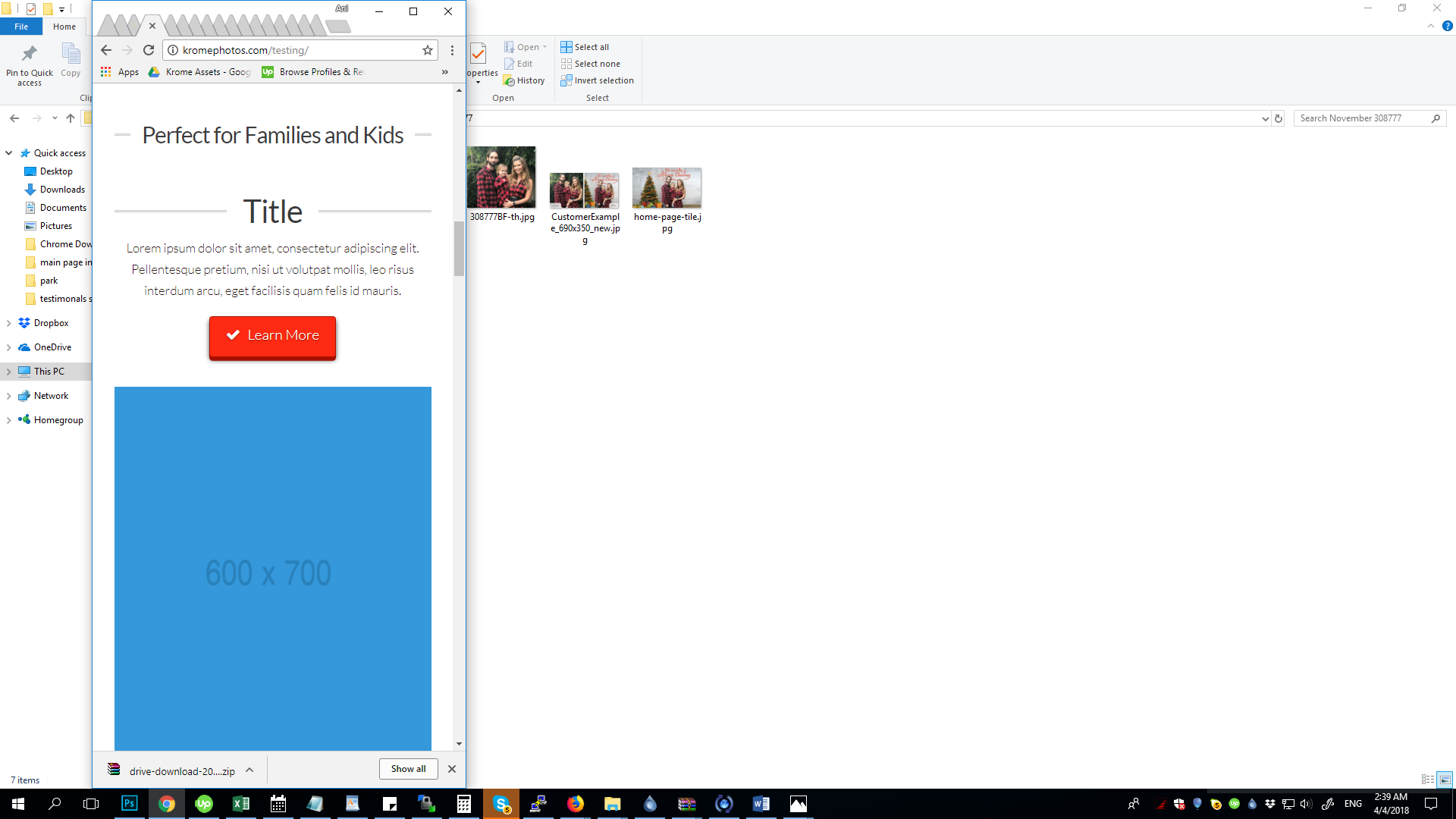
When I check it out on my phone or simply reduce the browser width to show the mobile version, I’m seeing placeholders, instead of the content I’ve already created.
How can I fix this?
Thanks,
Ani
Hi there,
Here is the page I’m working on:
When I check it out on my phone or simply reduce the browser width to show the mobile version, I’m seeing placeholders, instead of the content I’ve already created.
How can I fix this?
Thanks,
Ani
Hi @Dimitrova,
Thanks for writing in.
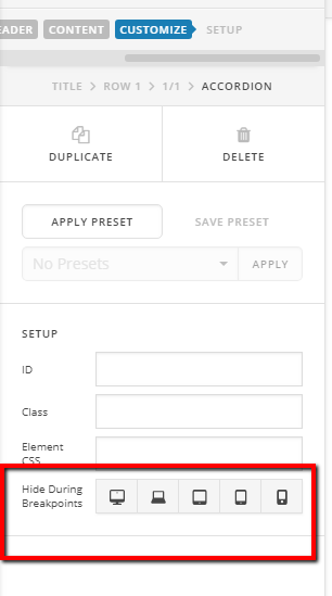
I believe this is because of the HIDE BASE ON SCREEN SIZE.
First, Identify the element or place holder that are showing in small sizes. To identify it, use this icon below.
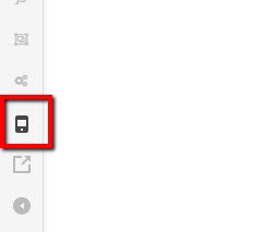
After you identify it, click the element then click customize so that you could see the hide element base on screen size. From there, you can control the element.
Hope it helps.
Let us know how it goes.
Thanks.
OK, thanks for the tip. However I don’t have the visibility of any of the elements I’ve added turned off for mobile, but they are not showing up in the mobile version. I’ve removed the placeholders, but why isn’t the content I’ve added in the mobile version?
Hi There,
This template comes with sections for mobile which you can just see if your browser or cornerstone builder is set to mobile size.
You need to check the rows, some of them are marked to be hidden on desktop and laptop screenwidth.
Hope it helps
This topic was automatically closed 10 days after the last reply. New replies are no longer allowed.