Hello, X-Masters.
I need your help.
The section has not correct mobile view.
Look at my screenshots in 2 resolutions of screen.
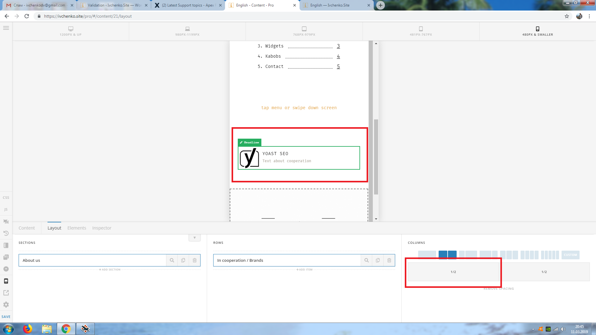
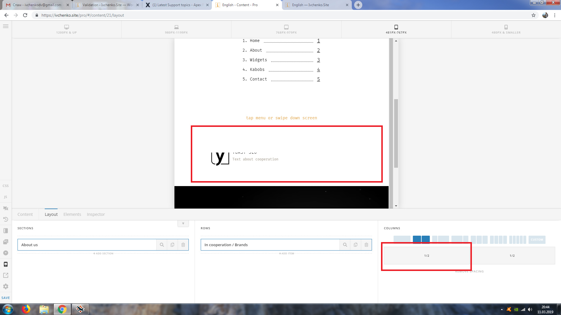
Desktop view is…
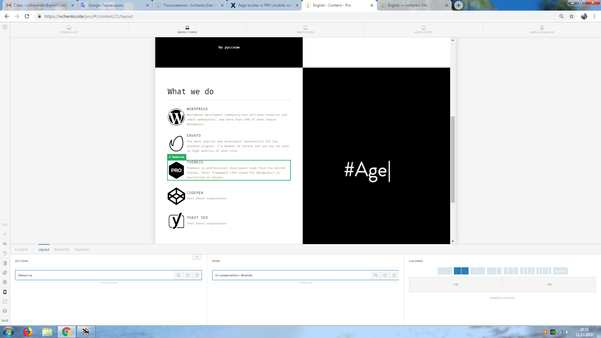
What is problem?
Thank you.
Hello, X-Masters.
I need your help.
The section has not correct mobile view.
Look at my screenshots in 2 resolutions of screen.
Desktop view is…
What is problem?
Thank you.
Hello Dimitry,
Thanks for reaching out. 
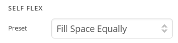
Please try editing the header builder and under Container > Navigation > Self Flex and select Fill Space Equally and see how it goes.
Thanks.
Hi.
Thank you for the tip. But this way does not nice result.
Have you other solutions? 
Hi Dmitry,
I went ahead and changed both of your container’s self flex values from ( 1 1 420px ) to Fill Space Equally ( 1 0 0% )
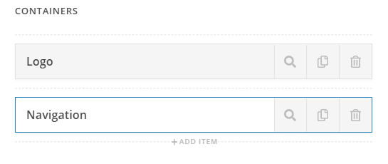
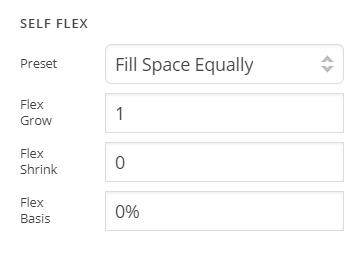
That seems to have fixed the cut-off issue. You were using a large value for flex-basis i.e 420px which was breaking the layout. Instead of using custom flex values It’s best to choose from the Preset to avoid such conflicts.
To learn more about Flexbox please see https://css-tricks.com/snippets/css/a-guide-to-flexbox/
Hope this helps!
Thank you very much 
You’re welcome.
This topic was automatically closed 10 days after the last reply. New replies are no longer allowed.