Padding & Margin Issues

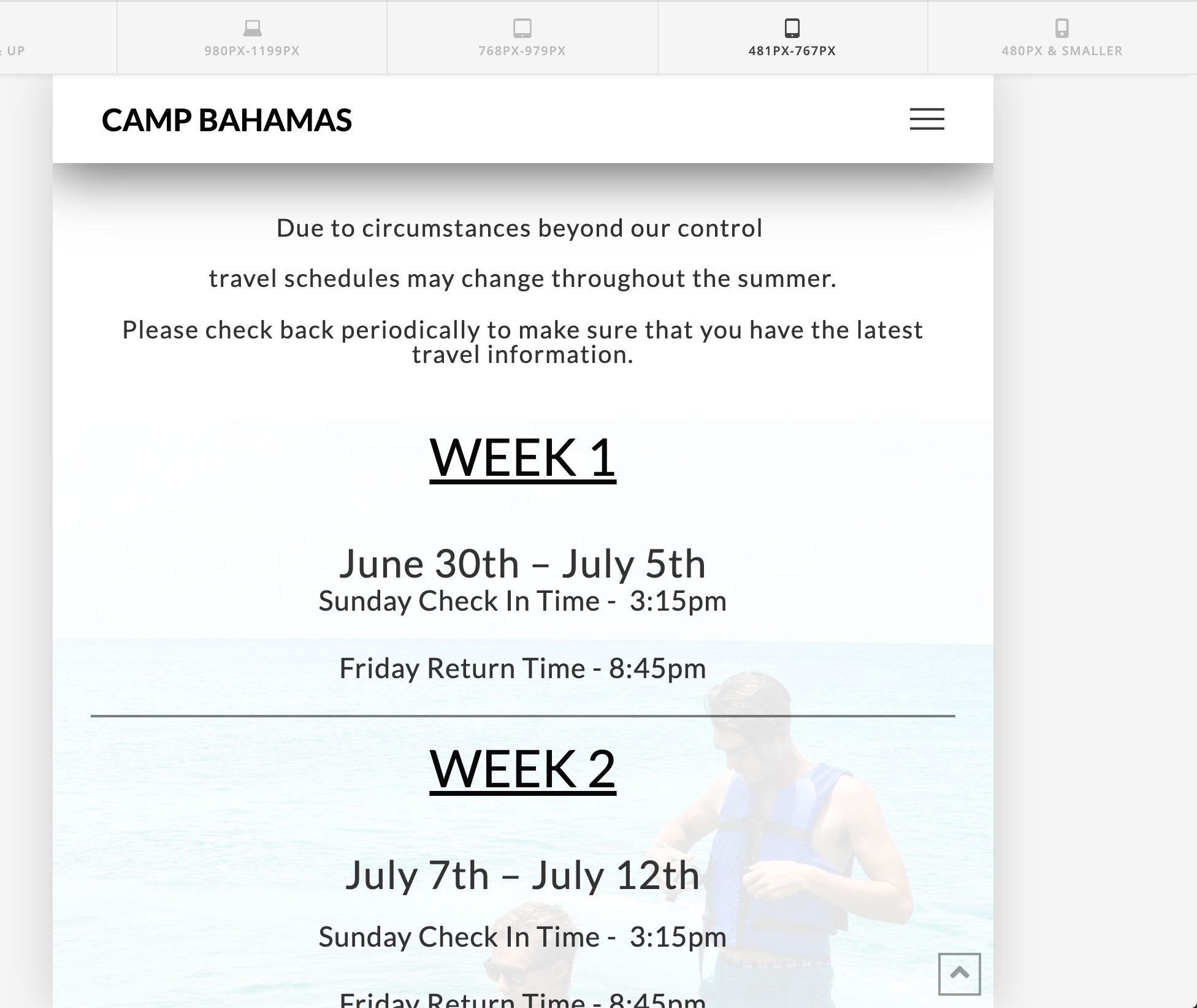
Here is the page in question:
https://www.campbahamas.com/travel/

I’m having trouble with the section that begins with “Week 1”

For the life of me I can’t figure this out… I’ve adjusted padding and margin many times but it never looks well on mobile and desktop. The problem is that the top columns are above the background image (especially on mobile) . What am I missing? Probably something simple.
Hello Denaj,

Thanks for writing in!

Please keep in mind that the columns will collapse being stack to each other in smaller screens. If you need some space in between the elements, you can either add the bottom padding or margin to the last element added inside the column or you can add a bottom padding or margin in the column settings instead.

Hope this make sense.

This topic was automatically closed 10 days after the last reply. New replies are no longer allowed.