Padding changes after mobile menu is opened

Hi,

I am having some wierd stuff going on with my mobile hamburger menu.

The padding on top of my site is pretty big, then after i open the menu, in stead of snapping to the top of the page it hovers over the topmost part

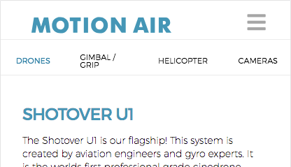
http://motionair.no/contact/ is a good example.it loads nice. but if you scroll down and back up again it hovers over the header.
if you open before you scroll it works well, but after scrolling it never goes all the way back up again.

Also, the blue Motion Air text on top is not visible on all pages for some reason… any idea why?

Please advise :slight_smile:
Thanks!
-R

Hi There R,

Thanks for writing in! Upon testing, I can confirm the issue.

It seems to be related to your custom CSS rules added into your site. Try removing all of your custom CSS rules which has @media and see which CSS rule causing the issue.

Also make sure to purge your server cache and browser cache before testing (https://www.wpbeginner.com/beginners-guide/how-to-clear-your-cache-in-wordpress/).

However, motion air text is visible on all pages. Could you please try clearing your browser cache and re-test.

Thanks!

you were right about the text, showed up as planned after cach delete.

but, i cant figure out the spacing on top… try this link in stead. the gap on top changes after i scroll for some reason…
http://motionair.no/drones/

Hi There,

To fix the padding issue on mobile version of this page, please add this element CSS to the first section:

@media (max-width: 979px){
     $el.x-section {
         margin: 55px 0 15px !important;
         padding: 0 !important;
    }
}

Hope it helps :slight_smile:

That worked like a charm! thanks a lot :slight_smile:

On behalf of my colleague, you’re welcome. Cheers! :slight_smile:

This topic was automatically closed 10 days after the last reply. New replies are no longer allowed.