Oversized Logo gets in the way on mobile

I was trying to find a way to get my logo to cover more than just the nav bar and was able to resolve that, but now when I checl my mobile menu, the logo is in the way of the menu items.

The information I used to make the logo this way is from an older support article (https://theme.co/apex/forums/topic/over-sized-logo-inline/), and I was wondering if there is a way that I can just center the mobile menu items in order to resolve the issue?

The site I am working on is demo2.saltechsystems.com
Hello @SaltechSystems,

Thanks for writing in!

Please add following CSS under X > Launch > Options > CSS to vertically center align navigation on mobile:

@media only screen and (max-width: 500px) {body .x-navbar .x-brand { margin-top: 25px;}}

Thanks.

What I am really looking to do is just center the menu on mobile, but when I add the above code it seems to remove what I have purposely done to the logo on both desktop and mobile

Right now it seems none of my global CSS is being called and I am uncertain why that is…

Hi there,

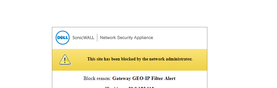
I tried checking your site but I am getting this message:

Please temporarily disable the IP blocker so that we could check it.

I will see if I can get someone in IT to assist me with this- I was able to resolve the CSS issue by removing and reinstalling the theme but I am still having issues with the mobile menu centering.

Hey there,

To center the mobile button, add the following code n the Theme Options > Global CSS or in the Customizer via Appearance > Customize > Custom > Edit GLOBAL CSS

.masthead-inline .x-btn-navbar {
    float: none !important;
    width: 50px !important;
    margin: 20px auto 0 !important;
}

To center the mobile menu items, make use of the following code:

.x-navbar .mobile .x-nav li>a {
    text-align: center !important;
}

Cheers!