Order of rows/columns

Hi guys,

I’ve watched and read tutorials/topics on how to build a different layout for mobile but I can’t seem to figure it out. On my homepage I have three rows divided by three columns.
1 4 7
2 5 8
3 6 9

On mobile view I need it to show
1
2
3
4
5
6
7
8
9

What is the easiest (and most understandable :wink: ) way to do this?

www.wanderingways.nl

Thanks!
Hello @astridjongbloed,

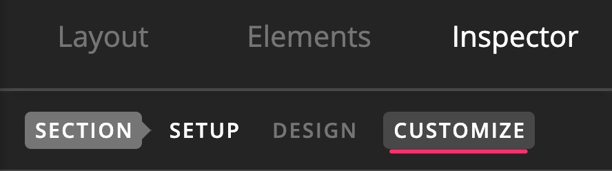
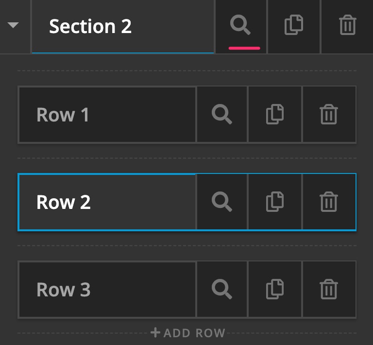
Firstly, you may duplicate the current section then hide it on mobile devices. Then hide the original section that contains the three rows with three columns on mobile size devices by doing these:

Next thing you need to do is to reorganize the images in the duplicated section in such a way that when on mobile it will be in the order you prefer. That should be something like:

1 2 3
4 5 6
7 8 9

Lastly, you will have to make this section appear only on mobile devices. To do that, you can do the same steps that you did to the original section but hide it in the opposite devices.

Hope this helps.

Hi Jade!

I finally understood how it works and it’s looking great now.
Thank you very much!

Astrid

You’re most welcome, Astrid.

This topic was automatically closed 10 days after the last reply. New replies are no longer allowed.