Hi @fxground,
That is actually normal since the columns collapse from left to right that is why the left columns are above the right columns on mobile.
A workaround that does not need a custom coding would be to duplicate the current sections you have and switch the contents of the duplicated section to have the left content place on the right and vice versa.
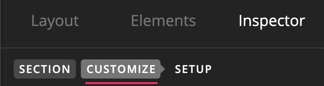
Once you have done that, you will have two section that will show up so in order to have only one display depending on the screen size, you can make use of the Hide During Breakpoints feature of the sections.


Hope this helps.
