One page links (#) weird behavior on mobile

Hi!

On this site: https://prenataalechocentrum.nl/media/

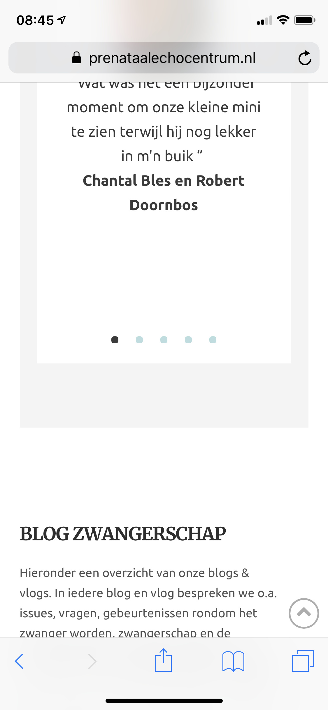
I have setup one page links. On desktop they work fine. But on mobile soon as you go to one of the links beneath the ‘media’ tab from another page. It ends up to high (you only see half the section where you want to be).

Why does this happen?

Thanks!

Hello Tim,

Thanks for writing in!

Upon checking your website I don’t see any issues related with links in Media and the submenus and are scrolling to the desired location. Can you please share some screenshot or screencast of the problem you are facing?

In the mean time, please try clearing cache and see how it goes.

Thanks.

Hi Prasant,

How did you check if i may ask? The problem is only visible on an actual mobile phone. Upon inspecting in desktop browser its perfectly normal. On my iPhone and also other phones it goes wrong. When I am on the home screen for instance and choose from menu: media>social you will go to the page in the middle of two sections (see attached screenshot).

Thanks

Hi Tim,

To fix it, you can add the following in Theme Options > JS

jQuery ( document ).ready ( function($) {
var hash= window.location.hash
if ( hash == '' || hash == '#' || hash == undefined ) return false;
      var target = $(hash);
      headerHeight = 120;
      target = target.length ? target : $('[name=' + hash.slice(1) +']');
      if (target.length) {
        $('html,body').stop().animate({
          scrollTop: target.offset().top - 160 //offsets for fixed header
        }, 'linear');
      }
} );

Hope that helps

Hi Paul,

Regretfully the JS does not help. It believe it’s get more out of target instead of getting better.

Any other solutions?

Thanks!

Hi @timschouwink,

Did you remove the custom JS?

It seems to work fine now on my iPhone 7 & Safari:

Regards!

Hi Thai,

Thanks for testing.I did not remove the JS. What you show in the screencast is within the same page. It only happens, when navigating from another page…

Thanks!

Hi Tim,

Please change the code to this.


jQuery ( document ).ready ( function($) {
var hash= window.location.hash
if ( hash == '' || hash == '#' || hash == undefined ) return false;
      var target = $(hash);     
      target = target.length ? target : $('[name=' + hash.slice(1) +']');
      if (target.length) {
        $('html,body').stop().animate({
          scrollTop: target.offset().top
        }, 'linear');
      }
} );

If that doesn’t help, please provide us your wordperss admin login in Secure Note

Thanks

Hi Paul,

Thanks! Regretfully is still does not function as it should. i will provide a login.

Hello Tim,

I have logged in and inspected your Media page. I found out that you have placed the IDs in the heading tag which is not the proper way. You should edit the page and relocate the IDs in the section because with sections, you can apply margins and paddings which will give you some space in displaying the specific section IDs in your small screen.

By default, the section IDs will be like x-section- {#}. If you add a custom ID, it will be replaced like adding blog as the ID.

Hope this make sense.

Hi RuelNel,

Have you go ahead and tested what you just describe? I had the id’s on sections but it gave the exact same problem. I changed it just to see if anything changes…

So it does make sense but does not help. It’s also quite obvious because we already found out that the problem only occurs from other pages towards the media page?

Thanks

Hello Tim,

In smaller screens, it will display and work perfectly.

Regretfully in iOs and Android devices, it is behind the browser’s address bar. To resolve this, you will need to increase the top padding of the section from 45px to at least double the height of the address bar in your screen so that the section contents has enough space to be displayed under the address bar and not behind it.

Hope this explains the issue briefly.

Hi RuelNel,

This cant be the solution…how come that scrolling on the same page is performing fine (same address bar)? Also when adding top padding, it only pushes the sections more down. Also it’s much more out of line that only the space of the admin bar! It’s about 3/4th of a screen!

Hello Tim,

This is how your site looks when I click Media > Blog from your homepage:

Chrome in my Android:

Opera in my Android

I do not have an iOS device so I cannot test it. One thing I know is that we do not have any control how the iOS displays the address bar in opening the page. The address bar has different behavior when you open the page or scroll the sections within the page.

Hope this helps.

This topic was automatically closed 10 days after the last reply. New replies are no longer allowed.