Offset columns within sections

Hi There!

I was wondering if it’s possible to be able to achieve in PRO offset columns with aligned background colors of sections like this site’s home page: https://www.mgga.nl/

More specifically, how the yellow boxes and light gray columns align while the dark grey box overlaps them?

And if so, would I be able to have these offset columns align with each other in a responsive way?

Thanks so much!
1 Like

Hi,

To achieve that, you can simple add negative top to your column.

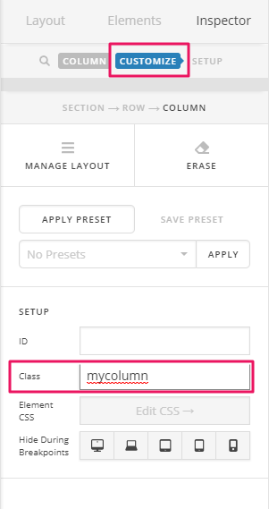
First add a unique class to your column.

Then add this in Theme Options > CSS

@media(min-width:767px) {
.mycolumn {
       top:-50px;
       z-index:9999;
}
}

You may change 50px to adjust the offset.
z-index is to make sure your columns is on top of the section.

Hope that helps

This is great! Thanks Paul. If I want to change that column positioning based on screen size, I can simply hide one column, add another, and make sure to give their classes different names so the code won’t break. Correct?

That is correct, Katie.

Sweet! Thanks so much Jade!

You’re welcome. Glad we’re able to help.

This topic was automatically closed 10 days after the last reply. New replies are no longer allowed.