I am currently on the latest version of Pro but i do not think this is any culprit. I was updating a client’s website from X to Pro and rebuilding a lot of components and I built the footer and it shows up on all sizes except the cellphone. I made sure nothing was hiding, and the footer is set globally across the entire website. Was hoping to get some advice. Maybe i am missing a piece of the puzzle and someone has the answer 
Hello @draguuu,
Thanks for writing in!
I checked the website and can see that a custom CSS is hiding footer from mobile device. Here’s the CSS shown in screenshot:
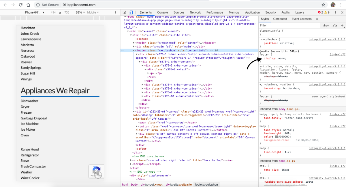
Please take a look at the Theme Options panel CSS editor and remove the code and that should fix the footer display issue on mobile.
Thanks.
This topic was automatically closed 10 days after the last reply. New replies are no longer allowed.