No Widget output on live website since last update

Hello,

So I’m using a widget to display a search function and have been for a while now.

Problem is here:

This is how it looked before and how it continues to look in the header builder - this is also how we want it to look :slight_smile:

This is what is on the live website:

We’re missing the widget :frowning: This was working fine yesterday. I updated Pro and this just happened.

Any ideas on what might be wrong? I’ve disable the plugins one by one but the error is still occuring.

Web address and login deets are in private note.

Speak soon hopefully

J

Also FYI - you might notice that the header is also outputting the incorrect header for it’s screen size i.e I’m looking at it on a 13 inch macbook and it’s outputting the full inline menu which is only for big screens. The smaller screens should be outputting the smaller inline menu.

I have also noticed that the header looks different on safari than it does with chrome with a padding line going through the middle of the header. To recreate this issue simply navigate to the “about” page while in google chrome browser - you will see a horizontal line appearing where the two “header bars” meet.

Not an emergency just yet - the first question is :slight_smile:

Sorry this never ends - so the client sent me this screenshot of the hamburger menu on their chrome screen in incognito mode. I am not able to replicate this on my screen but after all caches cleared this is what they’re seeing. Extremely inflated burger menu.

Quite a few problems…

Hey J,

1. Regarding the problem with your third-party plugin (VikBooking) widget, I see the conflict. This conflict is best investigated by the VikBooking authors because they might not be supporting the method that the Widget Elements use to output widgets.

The widget works fine in the sidebar.

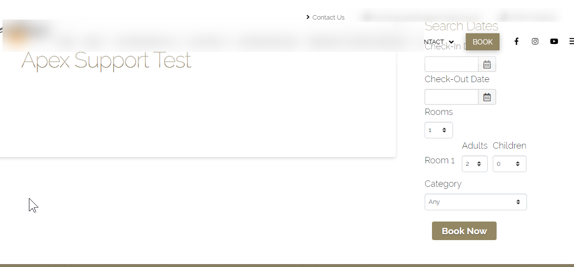
The difference is the Widget Elements use output buffering. Please contact the VikBooking support to see if they support that method.

For your and the VikBooking author’s reference, below are the directories and files of the Widget Area and the Classic Widget Area elements.

  • \wp-content\themes\pro\cornerstone\includes\elements\definitions\widget-area.php
  • \wp-content\themes\pro\cornerstone\includes\elements\classic_alternate\widget-area.php
  • \wp-content\themes\pro\cornerstone\includes\shortcodes\widget-area.php

2. Regarding the Inline Menu, are you referring to this header in the screenshot below?

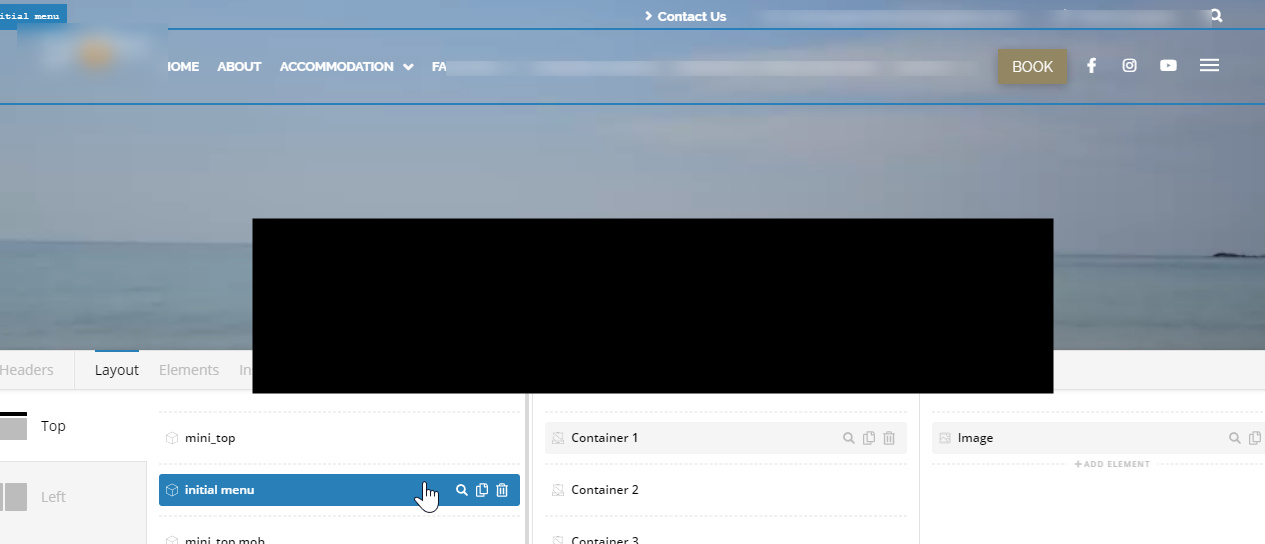
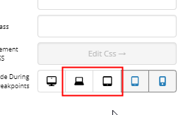
You need to activate the laptop and the tablet view also. The 13 inch Macbook might be in the range of laptop screen size.

If that’s not it, please tell us what header.

3. Regarding the line, it’s because of the 49.5px Margin Top of the Initial Menu bar. Changing it to 49.4px or below would fix the issue.

Hope that helps.

Regarding the burger menu, it’s because of the Minimum font size setting of the browser. Please tell your client to set it to Tiny. There’s currently no solution to override this setting of Chrome.

If you have other issues, please open separate threads for each because mixing topics in one thread often leads to confusion and the results to longer back and forth and prolonging our response time which is not good for both customer and support staff.

Hope that helps and thank you for understanding.

Hi Christian,

The changing of the height helped - strange that the output on Safari isn’t the same as chrome none the less.

Did you see the inflated Hamburger menu on their desktop too? Please see the end of the last message please.

In regards to the menu not being responsive on the live version you simply have to go into the Pro Header and select the screensize options. This will show you what I mean. I have disabled the element “inline navigation” on laptop, tablet and mobile - not the container. On Laptop and tablet another menu is enabled and on mobile there is no “inline nav”. Please toggle between screen sizes in the editor and you will see how each one should change yet on the live version it does not change.

Thanks for the input r.e Widget buffering although I don’t understand why it worked before and all of a sudden doesn’t work today… I’ll ask them to investigate.

In regards to the menu not being responsive on the live version you simply have to go into the Pro Header and select the screensize options. This will show you what I mean. I have disabled the element “inline navigation” on laptop, tablet and mobile - not the container. On Laptop and tablet another menu is enabled and on mobile there is no “inline nav”. Please toggle between screen sizes in the editor and you will see how each one should change yet on the live version it does not change.

The symbol is of a monitor for large and laptop for medium - A laptop is typically 13-17 inch and so I think the MBP 13" should fall within the category of medium. Looks fine on my 15" but squished on the 13"…

Hey J,

Thanks for clarifying. It’s still correct on my end though. Your laptop might be 13 inches but it’s resolution might be Full HD that is why you see the long menu even in small physical screen size.

What you need to look at is the resolution of the device as that is what the builder’s screen sizes use. You’ll see the minimum and maximum size of a builder breakpoint if you hover over the icon.

If you’re not sure what your screen resolution is, visit https://supportally.com/ and check the screen size. What you need to look at is the X or horizontal value.

Hope that helps.

Thanks Christian - yep totally get what you’re saying there, I never even looked at that. Be great if we could set those parameters as in this case you’re right - my screen is hi res and outputs the same as a larger screen hence why the proportions aren’t correct.

In regards to the widget output. The plugin authors of VIK Booking have agreed to look into it more tomorrow but have highlighted the following:
**

Everything is working fine, so I’m not sure what’s wrong with the widgets. We do support output buffering, it all depends on how your Theme handles it because Widgets are rendered by the Theme, not by our plugin, and so this means that there is not much you can change from Vik Booking.

**

I kind of get what they’re saying as just for example if you check the mobile version of the website and you press the “Book Now” button in the header you will see the output that is supposed to be there on the homepage shown below.

This works completely fine - granted I have embedded it using a global block instead of a widget area. I have tried to replicate this on the big screen where we’re having the problems by inserting the same global block but there is no output - only the widget header.

I’ve checked for javascript errors and plugin conflicts so now it’s a matter of whether it’s a VIKWP prob or PRO prob… both looking in each others direction :frowning:

Hi J,

I checked and I think it’s the issue on both end. Since the element data is inaccessible outside for v2, it could be that VIK plugin is unable to find their widgets based on the existing of strings or similar. Then since it can’t find it, it’s unable to enqueue its javascript code.

But, if it’s added as global block, it renders okay since a global block has accessible data in which hooks and filters are usually called (global block has its own rendering function since it’s a post type).

I think the solution would be integration between the two but as of now, I can’t provide any input as I’m not fully familiar how VIK Booking works. For temporary solution, please use Global block shortcode within content area element.

Thanks!

Hey Rad,

Thanks for your input - I didn’t even realise that there was a content area without a toggle - to me this makes more sense and is a legitimate work around.

HOWEVER… :slightly_frowning_face:

I have implemented this, cleared all caches and tada same problem… It works in the mobile version with toggle but in live mode on big screen it still does not work. I even deleted the bar and created a new one to see if there was something carried over the staging area but nothing…

This is where I think the problem can be isolated to just Pro because it works in the staging area but not on the front end. Also bear in mind that it was working before - it was only the next Pro update that killed it… I even have CSS still in the global area styling the front end from when it was working

Any thoughts on why this content area isn’t working on the front end?

Hi J,

No, it’s not Pro issue. The real issue is your widget. You can’t add the same widget on the same page and it’s your widget limitation. Please check the sample that I created (URL in the secure note). It’s not created in the builder, it’s just a simple page with added shortcode, I added the shortcode twice and the second one won’t work.

The same goes with the header, the first one works (content area with toggle), but not on other content area. On that page, I use a no header template just to prove it. But try using standard template with header on that test page, all other widgets on the content will stop working.

You actually provided me the clue, thanks! You can confirm all of this by switching to another theme and it will be the same.

Thanks!

Haha glad to help there :slight_smile:

The function that only allows it to have one widget per page is supposed to be like that according to the author see their comments:

Blockquote
If I can anticipate something, Vik Booking is written according to the MVC structure of PHP. For this reason, one Shortcode per page only is allowed. What your Theme developer said is correct, this is not an error but rather the desired behaviour. However, this has got nothing to do with the Widgets, which are rendered separately from a “View” (a page) of the plugin by using the apposite Shortcodes.

Now I need to figure out why the global block which technically is being loaded from a separate page isn’t working. The button version is only on mobile and not on big screen. Is there anyway that this can be isolated so that the homepage big screen widget is actually separate from the mobile version content area. The isolated areas need to be truly isolated.

I have activated the full screen version for now with hopes that we can successfully embed a shortcode in the mobile dropdown after figuring out how to isolate that particular shortcodes loaded page from being rendered on a larger device.

Any thoughts or work arounds for this?

Hi J,

I do understand that using a Global Block will render as a separate output function, but at the end of the day, you use the Widget two times at the endpoint which is the header. The limitation or feature of the widget will hold and you can not use the widget two times on the header.

The only viable solution that I can suggest is that you use the widget for the big screens, and use Custom CSS/Javascript code to use the same widget but change its view to the one that you have on mobile.

Thank you for your understanding.

hi Christopher, thank you for your input :slight_smile:

Can you elaborate on the CSS/Jscript to change it’s view? Be great to get this working if possible?

Also noticed that video backgrounds are now being supported by mobile browsers. Not sure if this is an accident or not? But I will now rethink the way that I have overridden this block in the past if mobile vid bg are here to stay :slight_smile:

Hi J,

You’re welcome! The video background is there even on older version, the limitation is imposed by mobile devices. And the video library that handles it is the Wordpress itself, the theme just utilizes it. But I guess it’s okay now and or depending to where it’s viewed. What was disabled for mobile is parallax feature.

Thanks!

Hi Rad - that’s awesome they must of lifted the ban! News to me for sure!

Any chance you can add to Christophers suggestion r.e CSS/Jscript to change it’s view? Be great to get this working if possible?

Hi @j300bac,

What Christopher meant above is used only one widget, instead of a separate widget for desktop and mobile, that way you only output the widget once. The widget is responsive right? so it should not be a problem.

Thanks,

Hey Friech,

It’s about where the widget is placed is the problem unfortunately - it is responsive but it looks untidy and so we want to keep it in the content area the same as we’ve done throughout the rest of the website when navigating away from the homepage

Hi J,

The problem is you’re adding the same widget on multiple places that can’t be solved by CSS or Javascript since the restriction is made through PHP code and in which there is no device-specific detection.

What Christopher suggested is to add the widget once and use CSS to control its visibility. But currently not possible since it’s added to two places, desktop header, and mobile toggle container. Hence, you have to eliminate both element where the widget is, then create a single element controlled by CSS and javascript and that would require custom development.

How about adding them as iframe content? Iframe content isolated to the current page’s frame hence it would work. For example, create a page without header and footer, and just the widget element. Then add the iframe to the content area with the toggle and header desktop an iframe that has src to the URL of that page where the widget is.

Thanks!

This topic was automatically closed 10 days after the last reply. New replies are no longer allowed.