Hello there
I’m having trouble with my columns when viewed on mobile. When the columns are stacked, the box shadow has no gap. Happening in 3 areas on this page. Can you help?
www.freshmethod.com.au/zyx-pricing-draft/
Thanks!
Hello there
I’m having trouble with my columns when viewed on mobile. When the columns are stacked, the box shadow has no gap. Happening in 3 areas on this page. Can you help?
www.freshmethod.com.au/zyx-pricing-draft/
Thanks!
Hey Stephanie,
The page you link goes to a 404 page. Columns do not a margin option so if you a want a space between columns on mobile, you can do the following:
Option 1: Set Global Bottom Margin on mobile through CSS
To do this, please add this code in the Global CSS:
@media (max-width: 767px) {
    .x-column {
       margin-bottom: 1.2em;
    }
}
Option 2: Use the Gap Element
You can add a gap element above the second column and only have it visible on mobile devices:

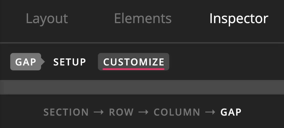
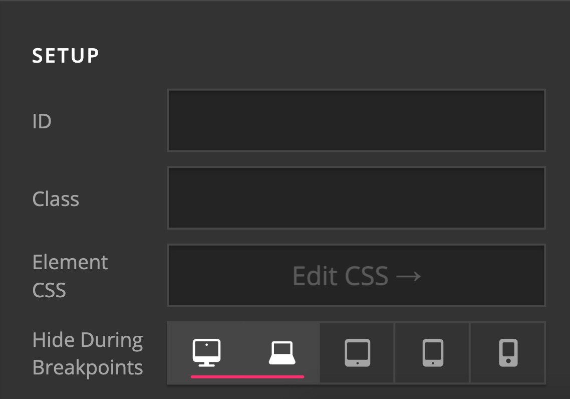
Hope this helps.
Apologies, this is the page https://www.freshmethod.com.au/xyz-pricing-draft/
Can I put that code under ‘additional CSS’?
Hey Stephanie,
Yes, you can place the CSS code in the Additional CSS panel too.
Let us know how it goes.
Thank you!
That solution worked for 2 out of the 3 problems. There is still an issue with the columns where I’ve used a box shadow. The gap is going within the box instead above the box.
https://www.freshmethod.com.au/xyz-pricing-draft/
Oh my apologies, that worked for all!! Thank you again.
Glad it’s worked now, I was checking and can’t find the overlapping box. Cheers!
This topic was automatically closed 10 days after the last reply. New replies are no longer allowed.