Need to Align Top Menu with Column

Hello there! I have instructions from our creative director to align the content with the top menu. However, I think the top menu is responsive but we would like it to align on desktops and laptops and I’m not sure how to make it happen, any suggestions?

Summary

This:
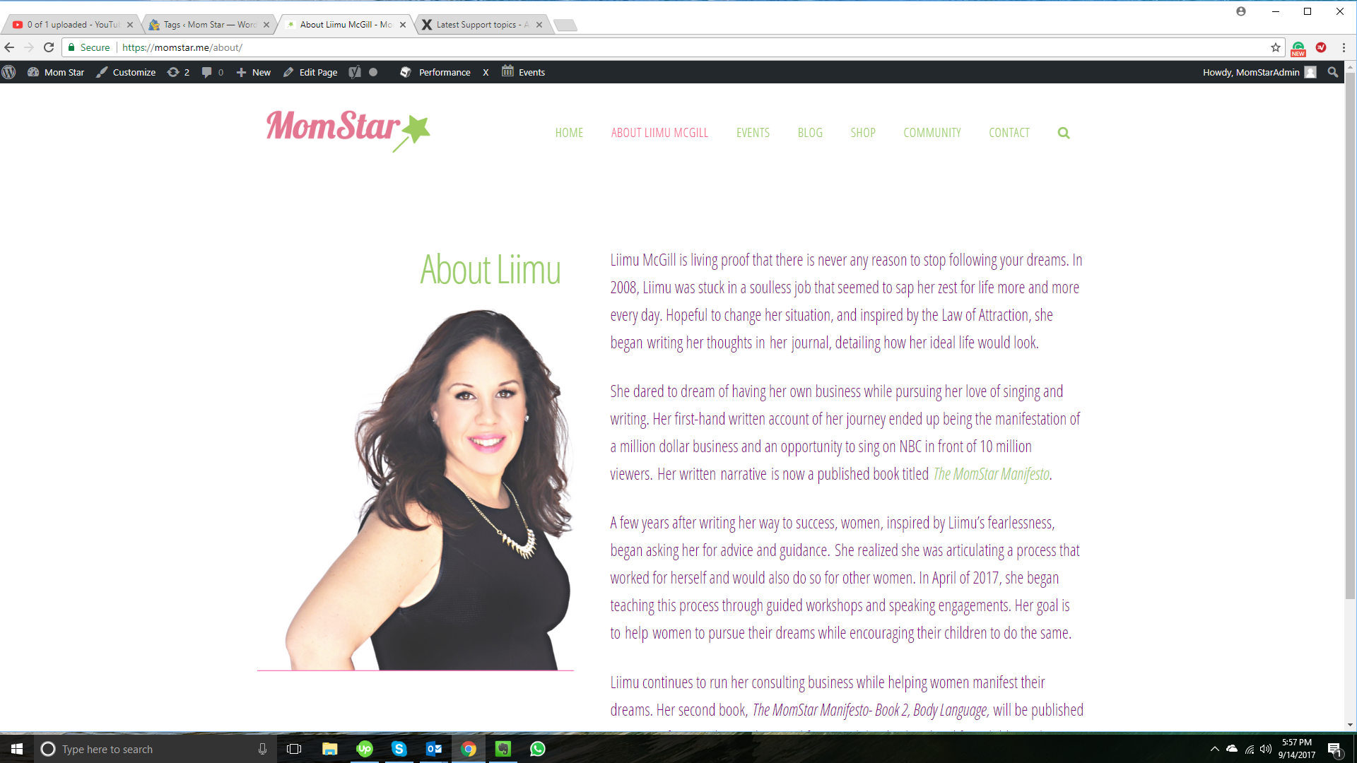
Needs to be:
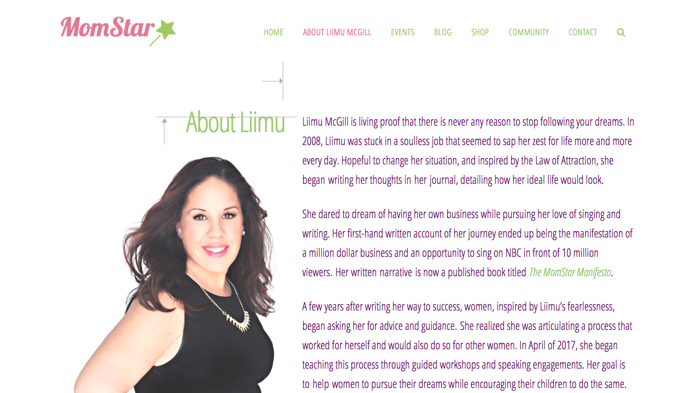
This:
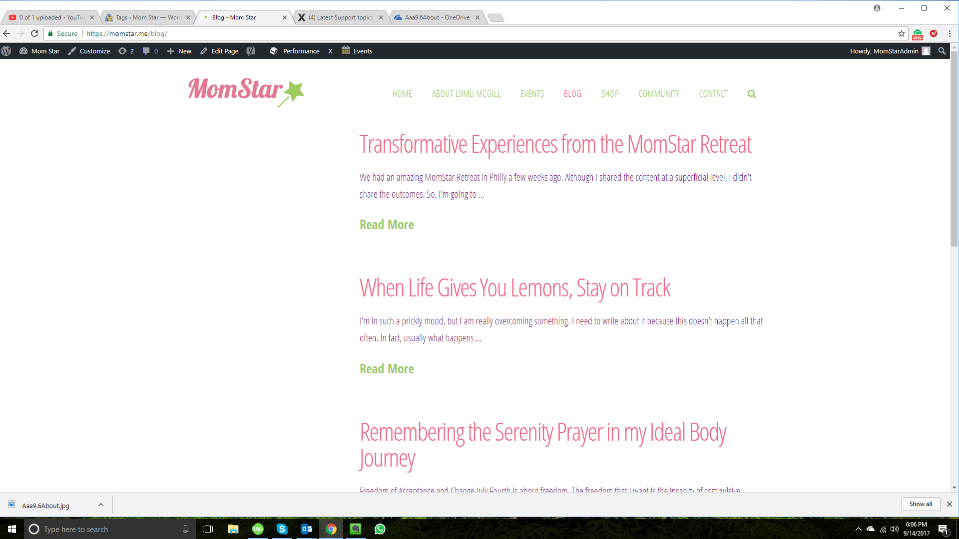
Needs to be:
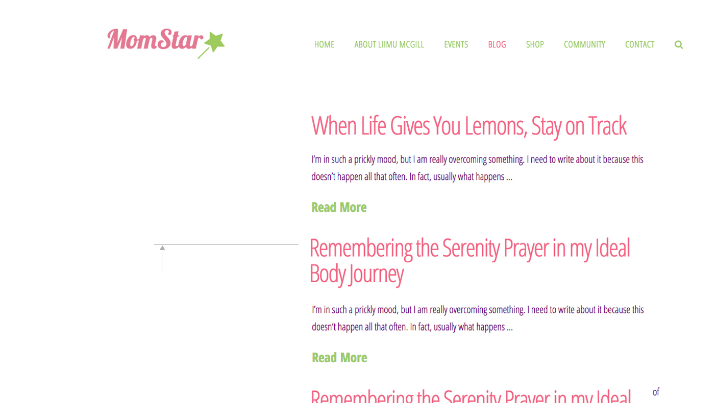
Annnnnd finally this:
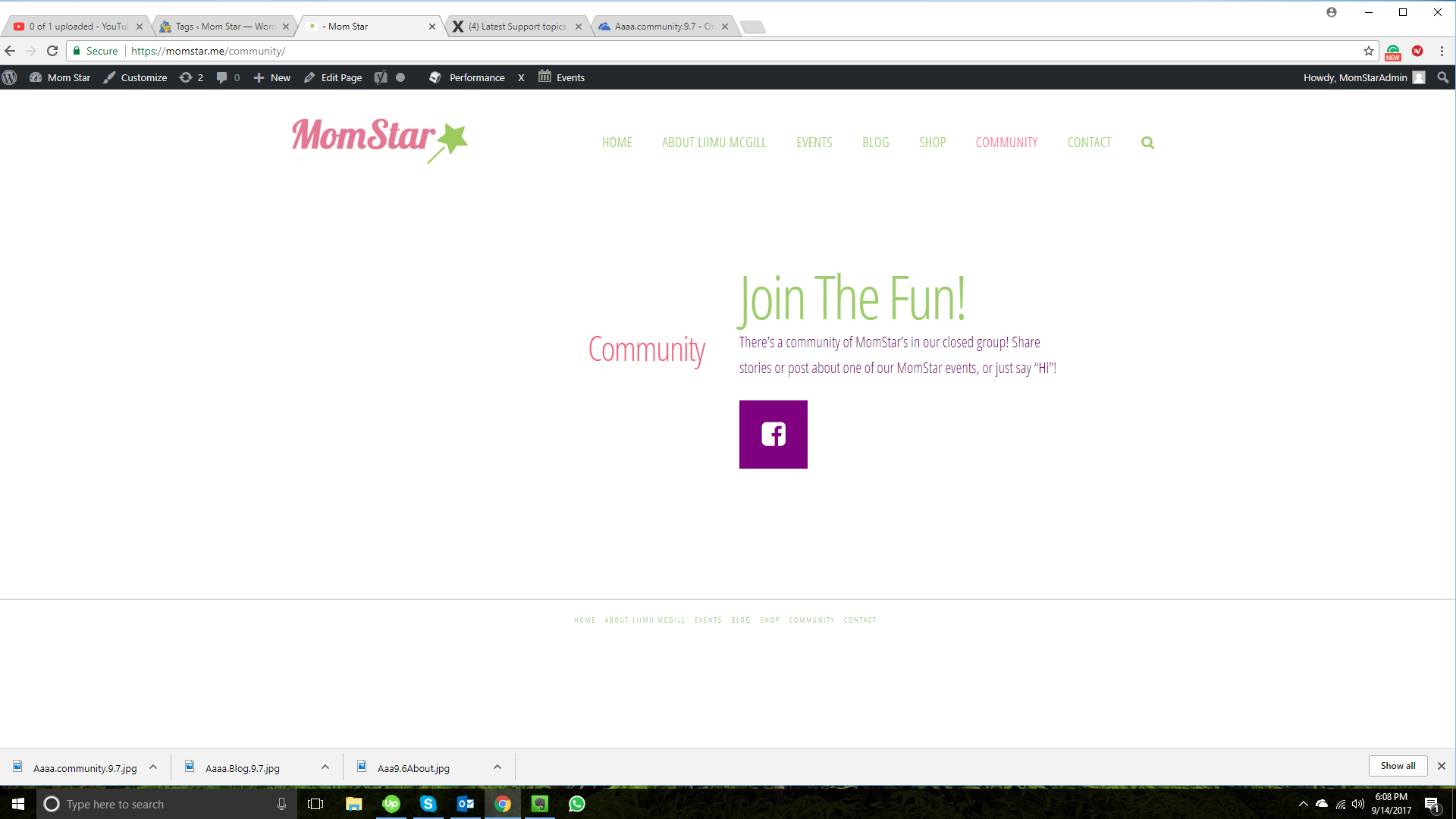
Needs to look like this:
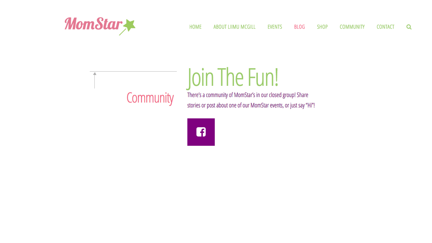
Hello @momstar,

Thanks for asking. :slight_smile:

About page: I can see you have applied inline CSS to heading element that also has margin-right: 70px;. Please change 70px to 40px and that should align heading element as per requirement. http://www.screencast.com/t/rdvqxjG4C

Blog page: Please add following CSS under X > Launch > Options > CSS to align blog layout: .x-main.right {width: 64%;}

Community page: You need to change the column layout. I believe layout of 1/3 and 2/3 should work well. http://www.screencast.com/t/MZNSCMTby

Let us know how it goes.

Thanks.