Need some advice on this

Hope you don’t mind but I just want to get your opinion on the best way to solve this problem.

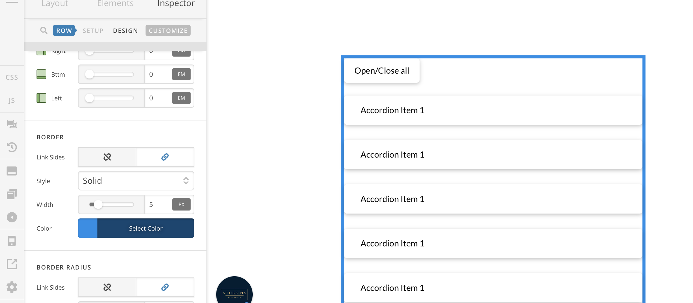
If you look at he below pic that is what I want the box and contents to look like.

However, this is how it looks on a large screen and when you grab the side of a web browser and reduce the size of it the box contents in the box move around and you get the results in the pics below.

So do you have any suggestions on how I can keep every thing the same as in the first pic when the screen size is reduced?
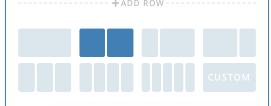
Hi There,

Please change the column layout of your row to 2 columns instead of 3:

Hope it helps :slight_smile:

Did try that but then I cannot get the blue frame around the 2 columns, is there a way to achieve that? as 2 columns would work

Hi There,

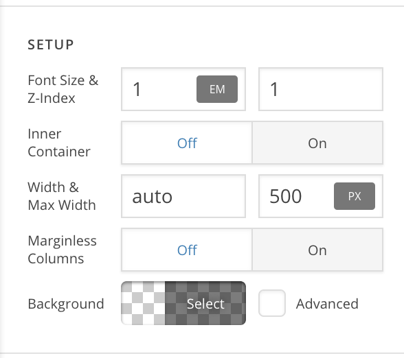
To achieve that, please change the layout of row to 2 columns then set max width for it(e.g: 500px)

After that add the border color for this row:

Hope it helps :slight_smile:

This topic was automatically closed 10 days after the last reply. New replies are no longer allowed.