Need help with product page display- images have shoved left

My woocommerce product pages main image area has increasingly been shoved over to the left leaving me with a lot of wasted real estate to the right of the main product image. It also massively distorts the thumbnails beneath.

Is there a way I can get more image room on my products and either get the thumbnails scrolling vertically to the left of the main image or showing beneath the main image in either a scroll or more than one row when needed?

Current layout
https://carladawnbehrlenyc.com/shop/resist-leather-pussy-hat/

This is the left side option (this one has a scroll)

Thanks for you help with this ongoing issue.

Hello @cdbehrle,

Thanks for writing in!

By default, the WooCommerce product layout is having the Image on the left and description on the right. The product image on top and then the thumbnails at the bottom. It slightly have a different layout when product slider is enabled. If you want to switch back to the old layout, you can check this thread:

By the way, the vertical scrolling is a default in WooCommerce. A 3rd party is need to be able to achieve what you wanted. Please check out any of this plugin instead:

Hope this helps.

That doesn’t answer my question, the product pages have WAY more space to the right of the image than ever before. It’s distressing how many issues have happened with X theme and new Gutenberg updated Now I cannot edit cornerstone posts Period; I get this message"
““This element could not render due to invalid template markup. This could be due to changes introduced by a third party plugin. The front end of your site should still function normally”” I am at this point so absolutl y fed up with Wordpress, Woocommerce AND Xtheme Themco - I am looking for other options.

This page is completely un-editable

Hi @cdbehrle,

The message means the content or data passed through Ajax is corrupted or something is added to it that makes the data unrecognizable. And it’s unavoidable if there are custom code, 3rd party plugin, or warnings due to WP_DEBUG that affects the output of the passed data.

Example, this is valid data

{id:"awesome_id"}

then something is appended to it.

{id:"awesome_id"} Warning: A non-numeric value encountered in /........./image.php on line 83

Then it will become invalid, and since WordPress is modular where plugins, themes, libraries, and custom codes are coming from different author then this is really not preventable. There will be form submission that can be affected, builder loading, styling, and anything that relies upon Ajax and serialized data.

I recommend providing your admin login credentials in the secure note so we could further check it.

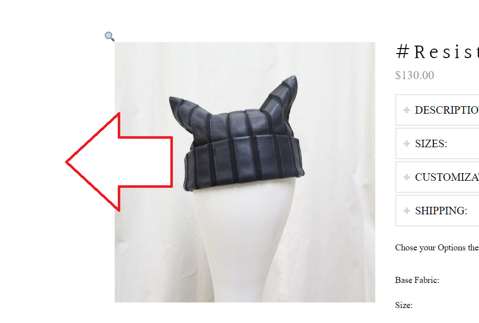
And I’m confused about your question about the product images. I checked your product page and it doesn’t resemble what you have in your screenshot and there is no space to the right. And if you’re referring to achieve the similar look in your screenshot, it will need a 3rd party plugin as Nel recommended.

Or are you referring to space in this left area?

If yes, then the layout must be changed to full-width, example, adding this to Theme Options > CSS should fix it.

.single-product .x-container.max {
    max-width: 100%;
}
.single-product .x-container.width {
    width: 100%;
}

But still, this isn’t going to change how your product images are displayed, you should install the suggested plugin.

Thanks!

No I am talking about all the space to the right of the images- The DESCRIPTION area is far wider than it used to be- Takes up far too much real estate!

The description area takes up far to much of the space on the screen! It should not be so prominent

That what I’d like to fix and it may UN squash the thumbnails in the process!

Hello @cdbehrle,

Did you added this codes?

.woocommerce div.product .images {
    padding: 40px;
    width: 600px;
}

Reduce the padding to eliminate the white spaces around your catalog image.

And also I found have found this:

.flex-control-nav.flex-control-thumbs img {
    width: auto;
    height: 8em;
}

Please update it to this code so that the image will not be stretched out.

.flex-control-nav.flex-control-thumbs img {
    width: auto;
    height: auto;
}

Hope this helps. Kindly let us know.

I think that helps! I am on a laptop but will be sure to check on a desktop and let you know.

Thanks for your help

We are delighted to assist you with this.

Cheers!

This topic was automatically closed 10 days after the last reply. New replies are no longer allowed.