Hi There,
Want to ask for help with this one. I want to make this drop-down button or these 3 lines a bit higher than what it is now in mobile view. Please see ss:
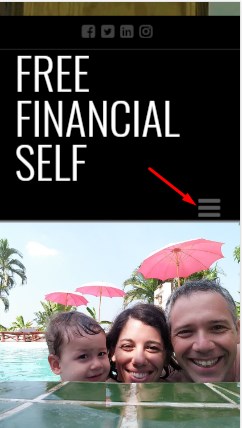
As you all see, it doesn’t have a margin and for me it doesn’t look good.
I want to have this image to be the best one.
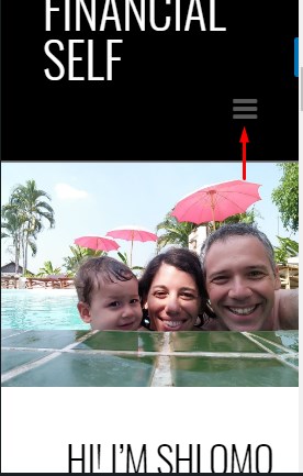
I thought I found the correct setup but when I checked it in desktop view, this was totally messed up.
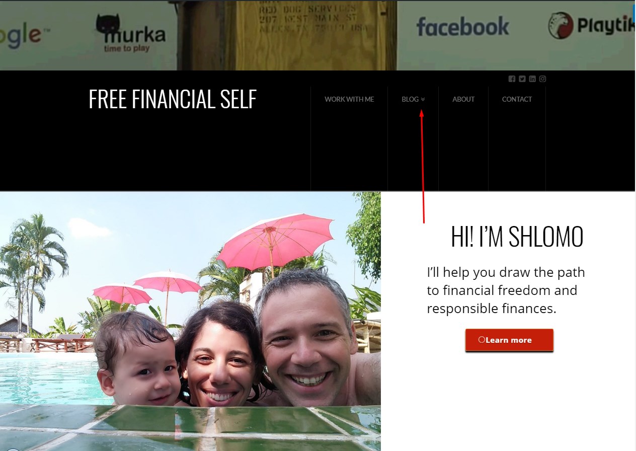
So you know that I increased the “Navbar Top Height” to 200px from its default setup 60px. Changing this not over 200px seems no changes in mobile view. The drop-down icon remains in the same position.
So I tried another option. My “Logo and Navigation” setup was set “Inline” as I chose to have the name of my company to be on the left side. Like this one:
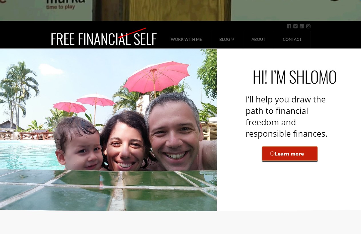
But when I change the “Logo And Navigation” from “Inline” to “Stacked” It seems that the drop-down icon which is the 3 lines in mobile view was fixed and it is now higher compare to what it was before. Please see ss:
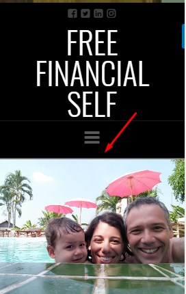
But, I also DON’T like that the name of the company would be in the middle of the Header in Mobile View and on Desktop view. So I want your thoughts on how to resolve this.
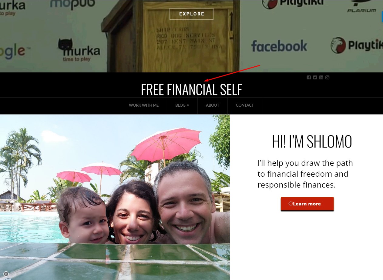
Just a recap:
I want to have the drop-down icon to be a bit higher on mobile view. And I also want to remain the name of my company to remain on the left side of the header. If it involves css, may I have your best codes? Thank you very much!
BTW, this is just Shlomo’s VA. Have a wonderful day!
