Need help getting homepage to look ok on Internet Explorer 11

Hello Themco!

I’ve discovered that my website’s homepage (https://theenergylogic.com/) looks very different on Internet Explorer 11.

I’ve looked at our google analytics and a portion of our traffic still uses that Internet Explorer. So, while I’d love to ignore this, I need to at least make the homepage look professional.

Can you help me try to fix these items?

Key issues (from top to bottom on the page):

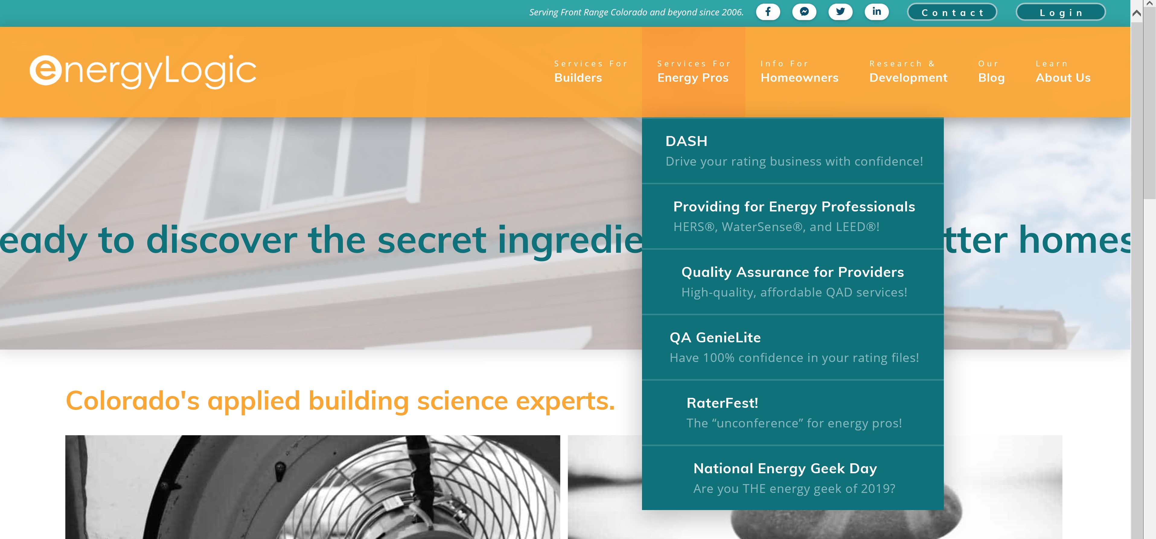
  • Dropdown menu alignment is all over the place. The drop down text should all be left aligned.
  • Hero text “Ready to discover the secret ingredient…” is going off-screen instead of wrapping.
  • Double scroll bar on right side of screen.
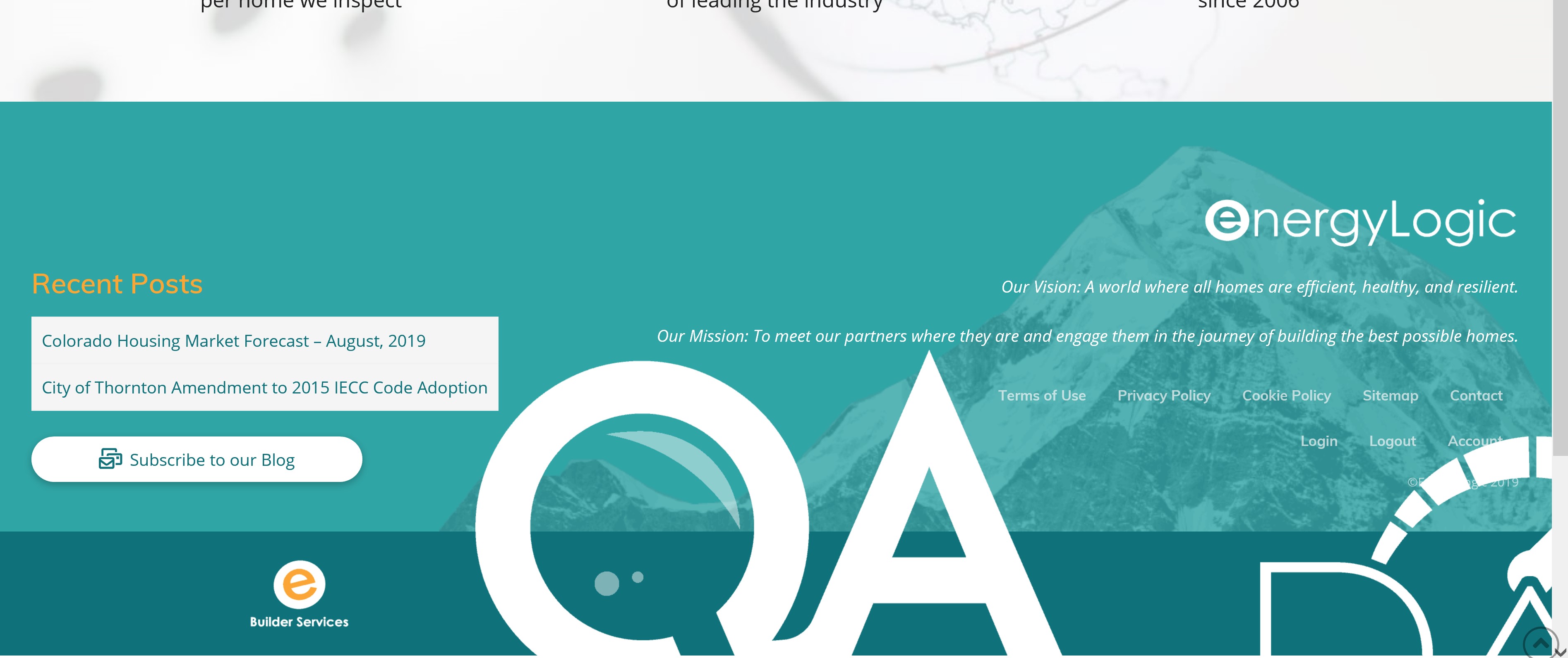
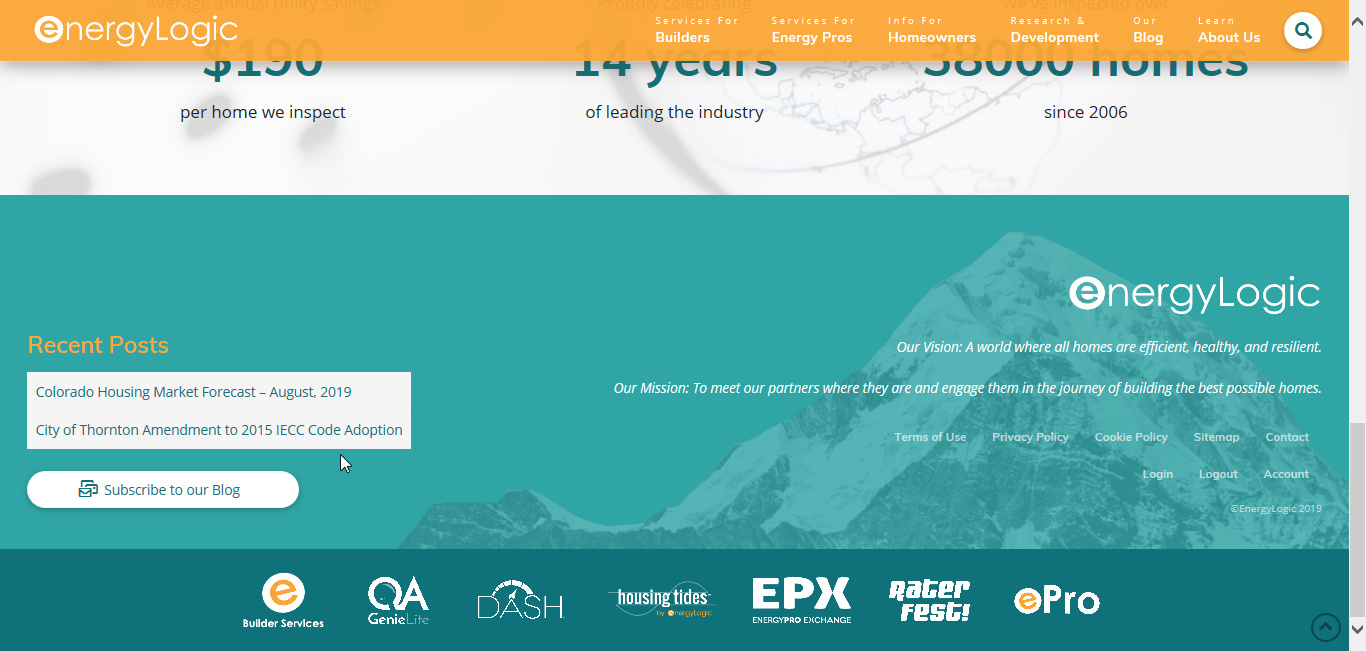
  • The “max width” values for the footer logos isn’t working. Some of the logos are huge.

Here are screenshots of what I’m seeing:
Thanks in advance for your help!
Hannah
Hi Hannah,

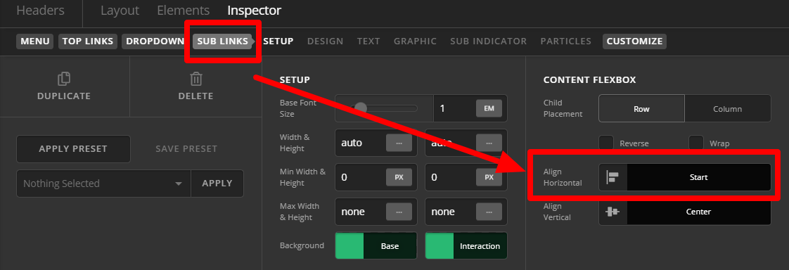
Please inspect the menu > Go to Sublinks tab > Content Flexbox > Align Horizontal: Choose Start

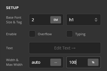
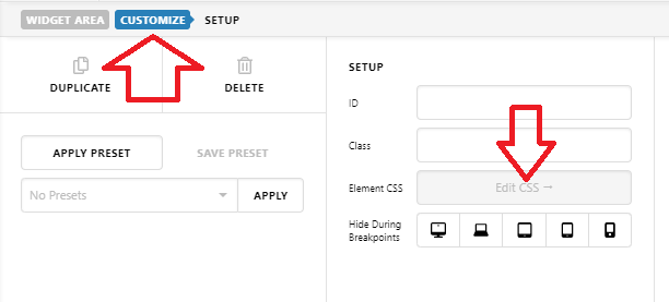
Inspect the element, on Setup tab > Max-width > Set it to 100%. This issue is due to IE flexbox compatibility. Adding 100% width is a workaround

This is a side effect of the image size issue on footer

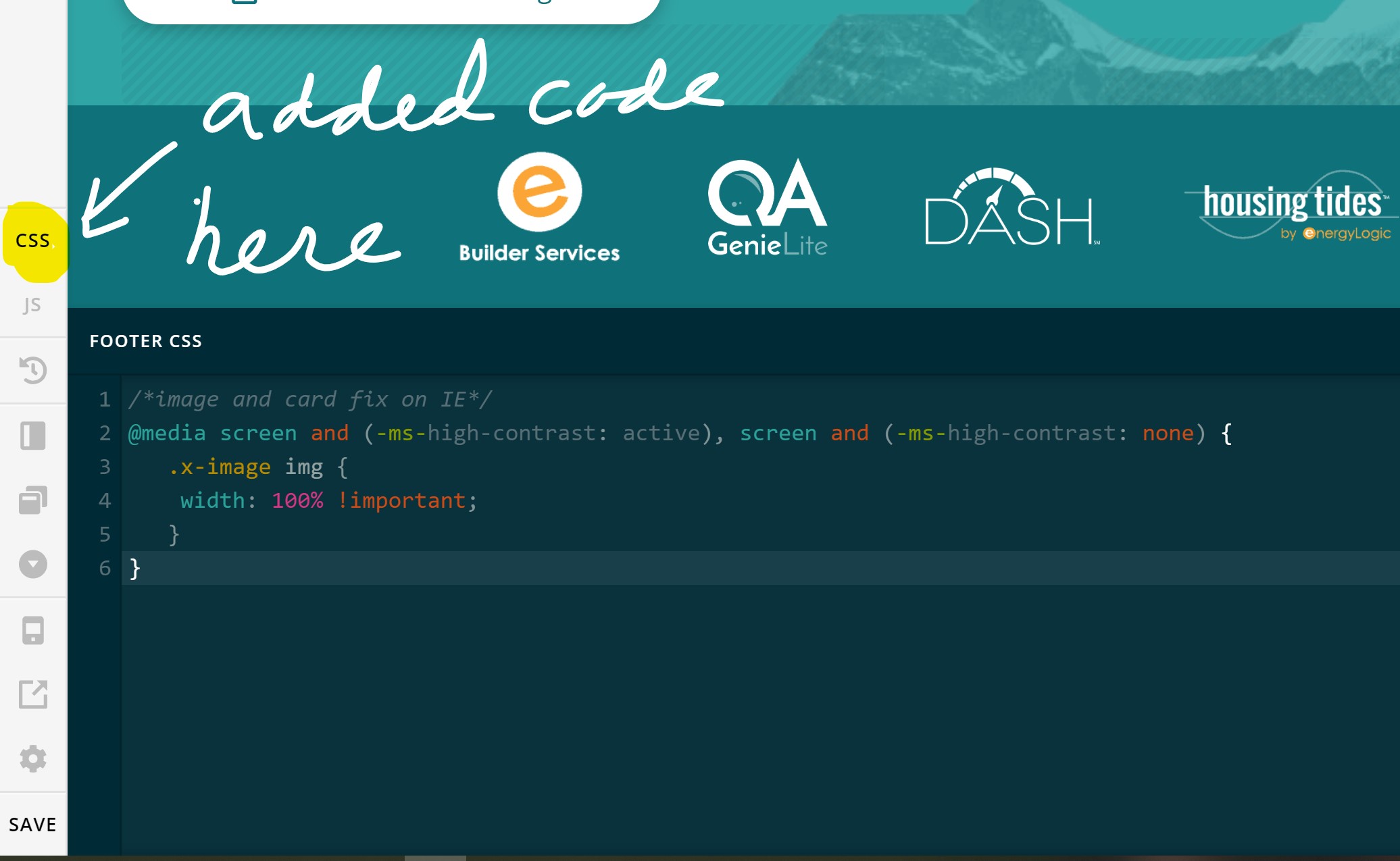
On you Footer CSS, try adding this fixed

/*image and card fix on IE*/
@media screen and (-ms-high-contrast: active), screen and (-ms-high-contrast: none) {  
   .x-image img {
   	width: 100% !important;
   }
}

Hope this helps.

1 Like

@Lely,

Wow! Thank you so much! You saved me so much time monkeying around with settings. I really appreciate it. Support like this is why I am so committed to using Pro!

Everything worked perfectly except for the CSS to fix the logo sizes in the footer.
I added it via the footer CSS block. Was that the right place, or should I add the code somewhere else?

You’re always welcome Hannah!

I can see the CSS for footer images is now working correctly: https://screencast-o-matic.com/watch/cqX1cCUfyw
Can you confirm?

1 Like

Thank you, @Lely!

You’re correct! There must have just been a delay.

I noticed two more small problems that I’d like to fix if possible.

  1. How do I limit the size of the “EnergyLogic” logo? It’s so large on IE that it’s pixelated.
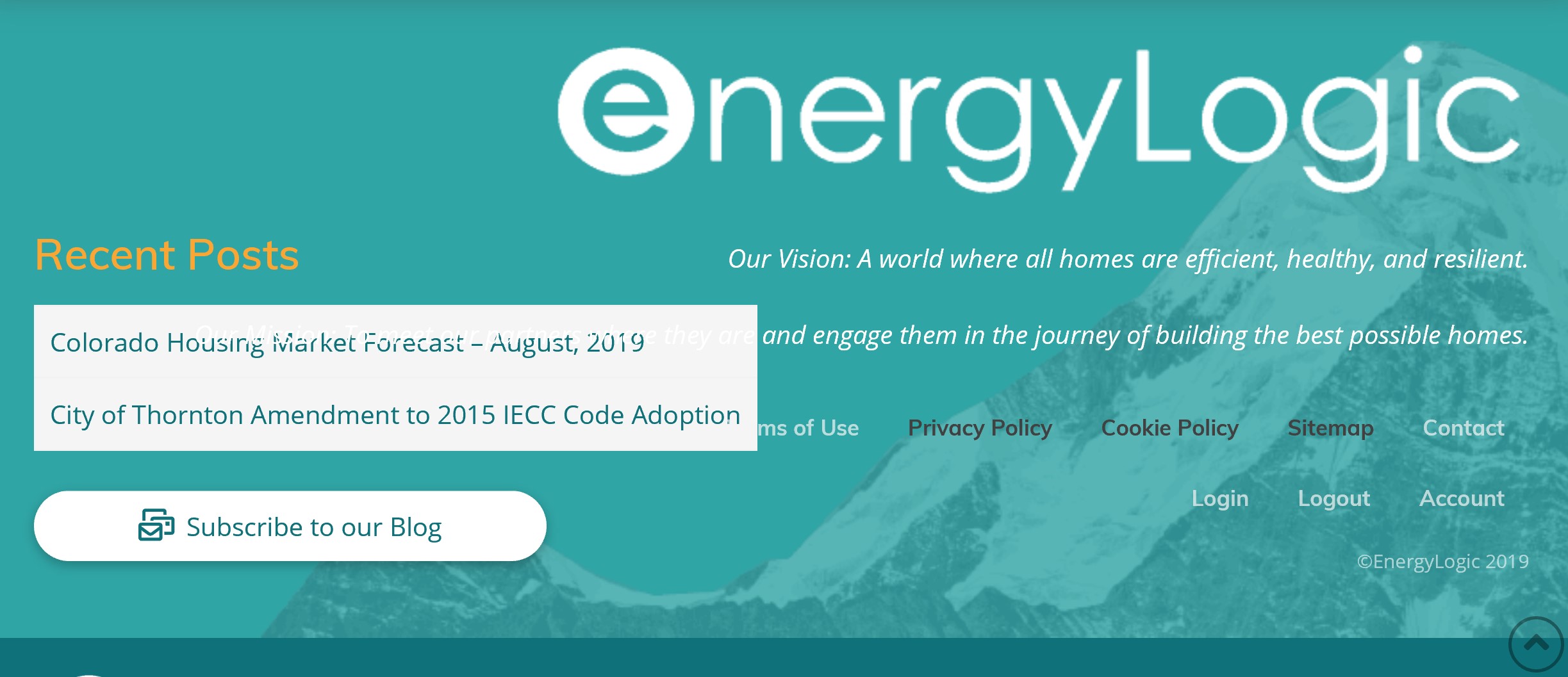
  2. The mission “Our Mission: Meet our partners where they are and engage them in the journey…” and footer menu “Terms of Use, Privacy Policy, etc” are overlapping the recent posts. How can we fix that?

Thanks again!
Hannah

Hi Hannah,

That could be your browser’s cache.

Regarding that last questions, this is how the footer looks on my end

It seems to be resolved now as well. Please clear your browser’s cache on your end.

Cheers!

Thanks!

I agree that the footer “energyLogic” logo sizing is fixed.

I’m still experiencing the text overlap issue when the browser window is narrow (post clearing cache and opening a private window).

Also, one small new issue… our header logo is stretching.

Both things are shown in this screenshot: https://sharesync.serverdata.net/us/s/6ONGzzbRGE1mF0tzSJ8zl5003d314d

Thanks again! :smiley:

Hi Hannah,

It’s weird, flex styling is not really properly supported by IE, it doesn’t work the same as other modern browsers. To fix it, please add this CSS to your widget element’s CSS

   @media all and (-ms-high-contrast:none) {
     *::-ms-backdrop, $el { width: 100%; } 
     } 

As for the logo, please remove this custom CSS

/*image and card fix on IE*/
@media screen and (-ms-high-contrast: active), screen and (-ms-high-contrast: none) {  
   .x-image img {
   	width: 100% !important;
   }
}

Instead, please add this to your footer’s image element’s CSS, similar to the above widget’s element CSS option.

/*image and card fix on IE*/
@media screen and (-ms-high-contrast: active), screen and (-ms-high-contrast: none) {  
   $el img {
   	width: 100% !important;
   }
}

This make sure the fix is only implemented to faulty element.

Hope this helps.

This topic was automatically closed 10 days after the last reply. New replies are no longer allowed.