need a clarification about cause i notice only one of the element when a designing it on a desktop view
and switch to mobile view and changed the design, the desktop is not affecting the mobile
but i only notice it in one element
here the example, i set the headline align left
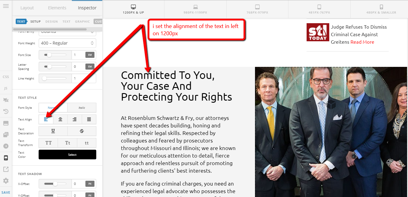
then on the mobile set the align center
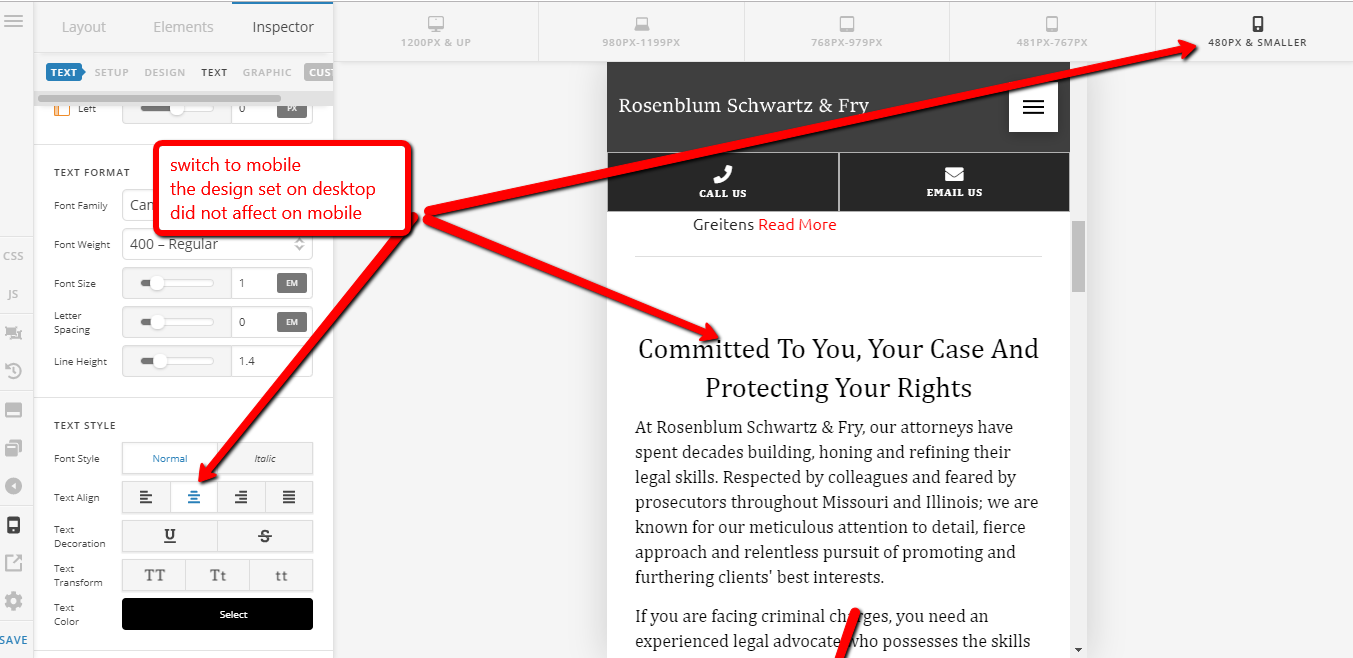
then switching back and fort from desktop view to mobile view
it did not affect it each other design but only in this element.
Hello There,
That might happen if you do have different element for desktop and a different element for mobile. It was hidden using HIDE BASED ON SCREEN WIDTH. You can find it in Customize tab. Basically, you have 2 elements. The first is hidden on mobile and then another one is hidden on desktop. To confirm if you have set it up this way, please check it on skeleton mode.
Hope this helps.
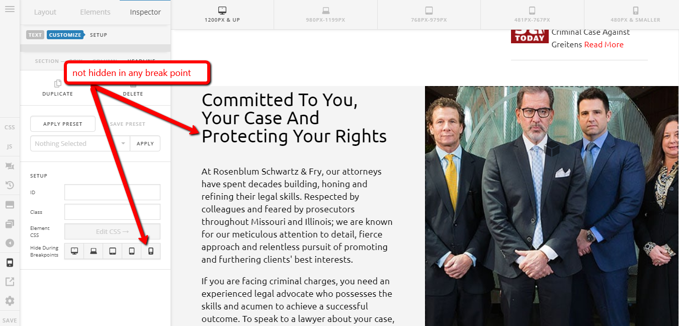
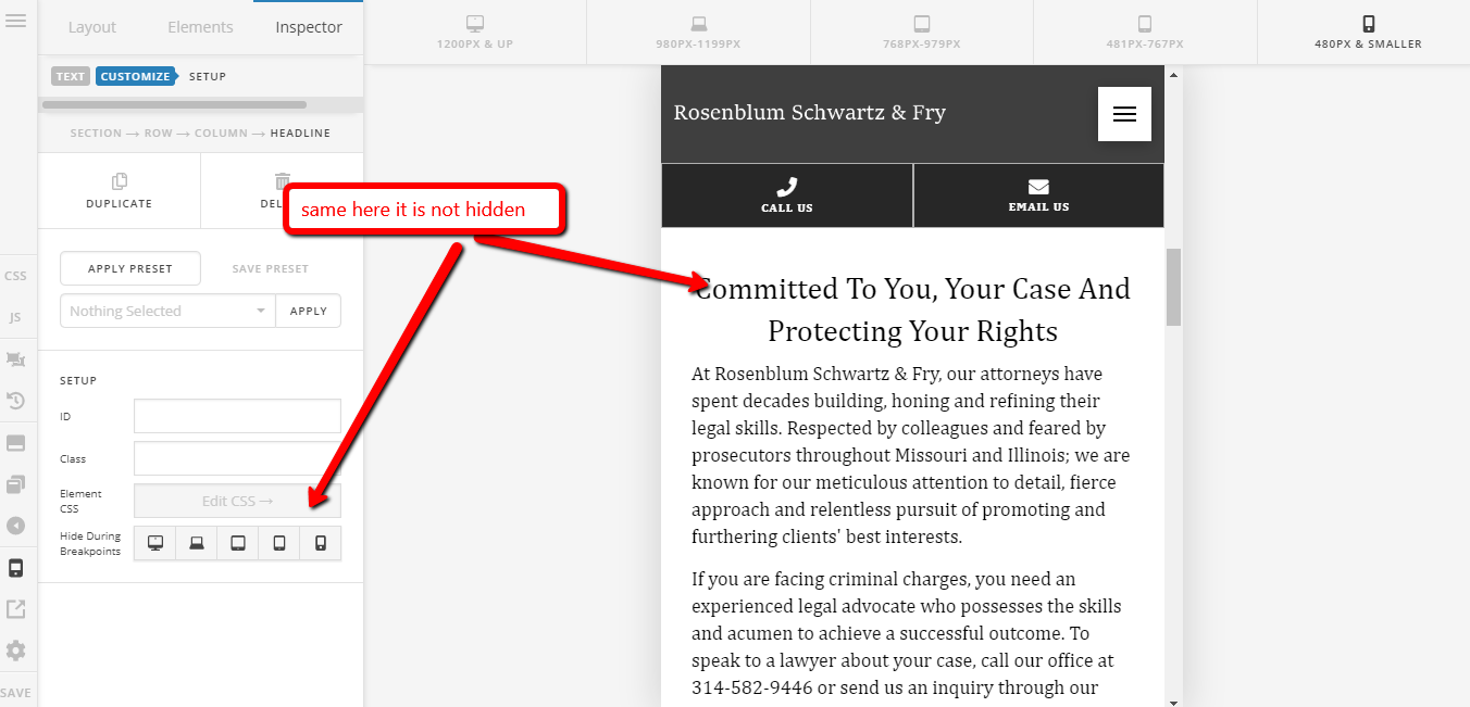
upon checking, it is the same element not hidden on any breakpoints
Hi Edward,
It doesn’t work the same as Revolution Slider device view where changes made are applied to that specific view. You’re just actually working on single and the same element across multiple views. You will have to duplicate that element and use that Hide During Breakpoints to hide first element from mobile (with left alignment), then hide the second element from desktop (with center alignment). They are not gonna hide automatically, you should click those device options to hide it.
Thanks!
weird because it’s acting that way…
Hi Edward,
I replied to your another thread which I think related to this. Again, it doesn’t work the same as Revolution Slider, you have to duplicate the elements and control it with Hide During Breakpoint feature to specifically display each element for each device.
Thanks!
This topic was automatically closed 10 days after the last reply. New replies are no longer allowed.