Navigation Spacing & Mobile Size

Hello,

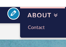
My sub-menu navigation currently overlaps onto my main navigation.
For example, if you hover over “About” the “Contact” navigation is nearly covering “About.”
I’m sure I messed up some of the font size or spacing issues, but can’t resolve.
ALSO

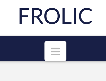
On mobile. My navigation icon is far too close to the bottom of the navigation bar.
Again I think my spacing is off. Cant;t fix. Thank you!
Hello @MichaelAnthonyMurray,

Thanks for asking. :slight_smile:

You can add following CSS under X > Launch > Options > CSS to resolve navigation overlap and mobile hamburger spacing issue:

.x-navbar .desktop .x-nav > li ul {top: 40px;}

.x-btn-navbar, .x-btn-navbar.collapsed {margin: 5px 0px;}

Thanks.

Hi Prasant:

I want to remove empty space below the mobile “hamburger” menu button. I can’t figure out how to do it. Margin and Padding for .x-btn-navbar does not seem to help. Padding for .x-btn-navbar.collapsed controls space around the three bars. But the NavBar show empty space below the Hamburger. When the menu expands (i.e when Hamburger dissolves) the empty space goes away.

Thanks.

Hi there,

We totally understand that the problem might be the same but we encourage you to open up a separate thread so we can follow up the case specifically for you and give you a better service.

By the way, the Secure Note is visible to the original poster of a thread. So you need to be the original poster.

I removed the Secure Note from here.

Thank you for your understanding.

This topic was automatically closed 10 days after the last reply. New replies are no longer allowed.