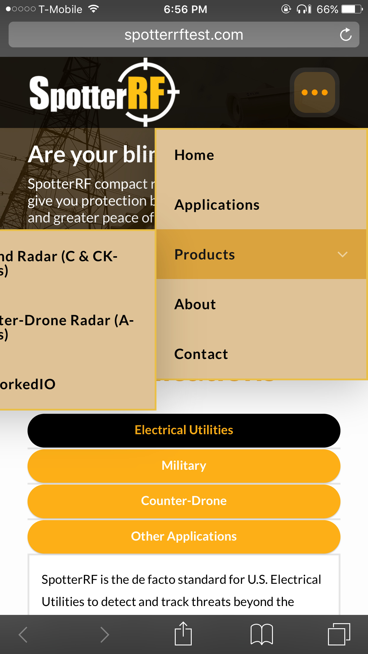
Navigation Dropdown cut off in mobile view

Hi!

I’m working on a site and the header builder has been great, but when I’m in mobile view the submenu of the navigation dropdown is getting cut off. Is there any way for the submenus to be in the same window or any way to fix this?

Here is the website:
http://spotterrftest.com/

I changed the margins to push the main navigation dropdown to the right but and it looks good in the header builder preview but when I go to it on my phone (iPhone 6 Plus) it gets cut off.

Hi there,

That is correct because there will be no room for the submenu dropdown item for the mobile view. I suggest that you use the Navigation Collapse element instead of the Dropdown for mobile devices.

The Navigation Dropdown is not meant to be used in mobile devices.

Thank you.

1 Like

Lol I can’t believe I didn’t realize that. I hadn’t even touched the Navigation Collapse element. I was just going off of the Hero header template. Thanks a ton!

You’re welcome! :slight_smile: