When I make my screen smaller, the navigation bar moves below the top image. I would like for the navigation bar to remain above the top image no matter the size of the screen. What setting enable me to do this?

Hi,
It moves below because your menu doesn’t fit the space anymore on smaller screens.
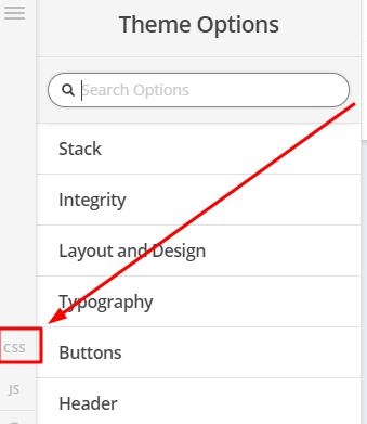
We can make the mobile button appear earlier, please add the code below in Theme Options > CSS
@media (max-width: 1170px) {
.masthead-inline .x-btn-navbar {
    display: block;
    float: right;
}

.x-nav-wrap.desktop {
    display: none;
}

.x-nav-wrap.mobile {
    display: block;
}

.x-nav-wrap.mobile.x-collapsed {
    display: none;
}
}
Hope that helps
Thank you.
Hi again,
We’re glad we could help however for your particular scenario you can refer to the following thread as well https://theme.co/apex/forum/t/header-inline-issues/53304/2
Cheers!
This topic was automatically closed 10 days after the last reply. New replies are no longer allowed.