Hi!
https://www.bluemoondesign.fr/ :
I managed to adapt CSS for my Navbar to be transparent on Firefox, but now my slider disappeared on mobile version!
Any advice, please ?
Many thanks,
Hello @Toy49,
Thanks for writing in!
You are experiencing this issue because you have added this custom css:
.home .masthead {
    position: absolute;
    width: 100%;
}
.masthead {
    height: 0px;
}
To resolve this, you will need to update it and use this code instead:
@media(min-width: 979px) {
   .home .masthead {
    position: absolute;
    width: 100%;
  }

  .masthead {
    height: 0px;
  }
}
Hope this helps. Please let us know how it goes.
Hi,
Thank you very much, it works.
Now what can I do to display my revolution slider correctly on mobiles, please ?
Many thanks,
Best regards.
Hello @Toy49,
Instead of adding the Rev Slider in a section, please edit the page settings in Cornerstone then set the Rev Slider as Slider Settings: Below Masthead.
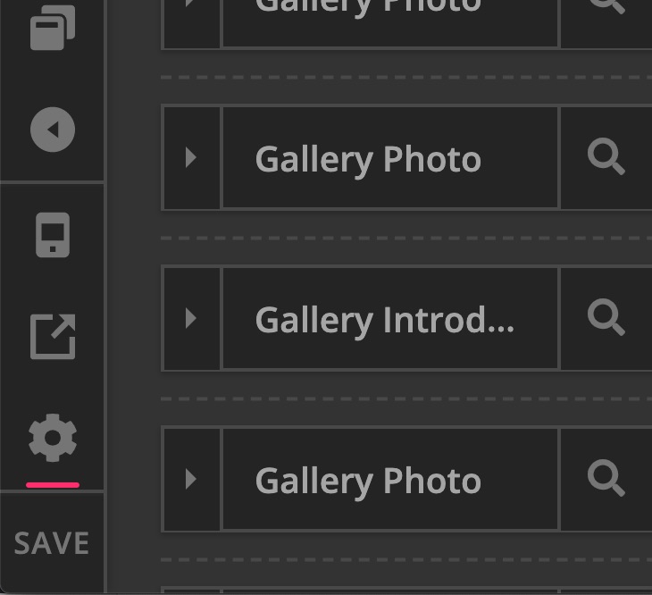
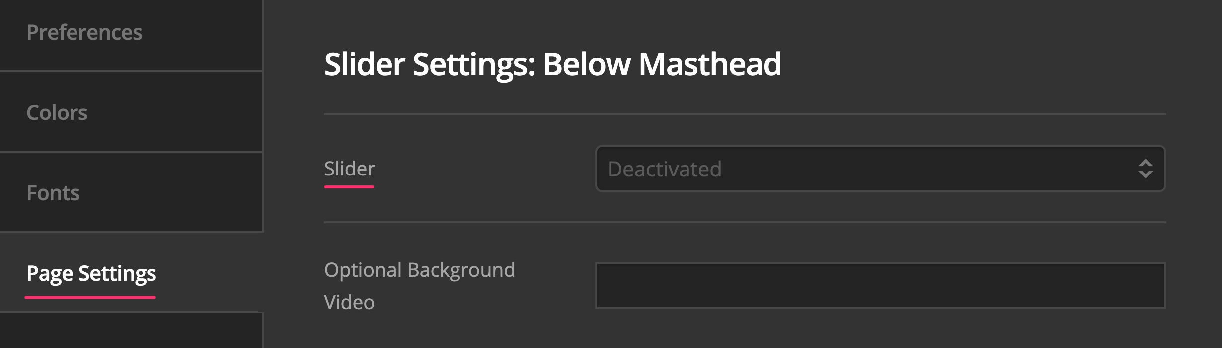
Hope this helps.
Thank you very much, it works perfectly ! 
I modified the spaces in order to place texts Welcome to Blue Moon Design’s universe and L’espace où l’imagination rencontre la technologie under the slider, but it’s not very precise.
Best regards,
Stephanie.
Hi Stephanie,
You just have to set the top padding of the section that contains the Welcome to Blue Moon Design’s universe and L’espace où l’imagination rencontre la technologie to some value less than 100px to move it closer to the slider:

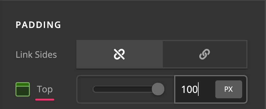
Hope this helps.
1 Like
This topic was automatically closed 10 days after the last reply. New replies are no longer allowed.