Hi there,
I have gone over the thread and I believe @thai gave a very comprehensive explanation about why your site’s menu drops and covers some contents of your pages and @nabeel proactively introduced some suggestions which you can try as a workaround your site’s issue.
X is a responsive theme. By default, the navigation area is set up to display a desktop version of the menu for screen sizes 980px and above and it will show the burger icon for screens 979px and below. This happens to your site so technically, the responsive nature of the menu works.
However, you have a limited space for the navigation menu area to display on one line for screen’s 980px above.
X is a responsive theme. The theme’s menu setup is that it will show a desktop version of menu for breakpoints 980px and above and will show the mobile menu below that breakpoints.
If your header layout is set as inline in X > Theme Options > Header > Logo and Navigation > Layout, in a proper design perspective, the entire header area content should display inline/one line having the site logo to the left and the main menu to the right. That is why there is a setting in X > Theme Options > Header > Navbar > Navbar Top Height (px) where you could set a fixed height for the header.
Currently, your site’s Navbar Top Height is set to 90px but since you have a lot of menu items in a limited space, your actual menu content exceeds that causing the header to cover some of the page contents as shown here:
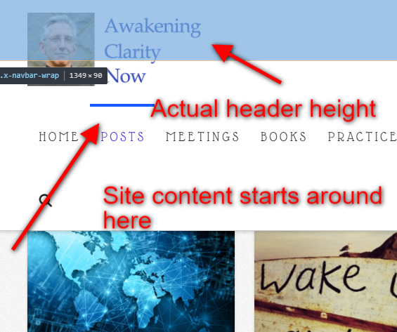
So for this setup, there are some workarounds you can apply including what Nabeel suggested which is either to override the theme’s default behavior where the mobile button will show earlier or to have the menu item font size smaller in order for the header to accommodate them in one line.
Another thing you can try is to override X’s default setting where it sets a specific height to the navigation area which is the Navbar Top Height option that I mentioned previously to auto which means that the header area’s height will automatically adjust to the header content’s/ However, that setting only accepts a px because of what I previously about the inline layout of the header. To override this setting, you can add this custom CSS:
body.x-navbar-fixed-top-active .x-navbar-wrap {
    height: auto !important;
}
The result will then be like this:
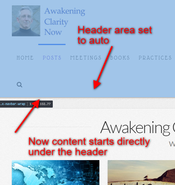
If you apply this workaround, your content area will always start below the header area regardless of how many lines the main menu fills the header as the screen width decreases until the mobile menu will show up.
Also, you mentioned:
I believe you have misconstrued what was initially explained for the issue.
It was not mentioned that this happens for all themes but rather ‘By the theme’ meaning, X. So since this is a default setup for X, you will have to apply some workaround in order for your setup to display correctly.
Hope this sheds light on your questions about why you are having this display issue on your site.
Cheers!

