My Header disappears completely on mobile

Hi. I just noticed today that my header disappears on mobile devices. It was working as a hamburger menu and you could choose it and see all the menu items in the same color as is on desktop version as created. Website is www.moneymanagementservice.com. I tried adding some code mentioned in another post similar to mine. But it did not fix the issue. So I removed it.

I just need to get this fixed asap because clients cannot find the client login section at the top and we have a big roll-out of a new web portal for them today.
Thanks in advance for helping me! Love the theme!

Audrea
Hey Audrea,

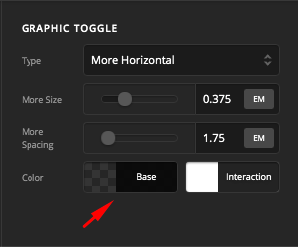
Thanks for writing in! The mobile menu is not showing because the color may have been accidentally changed to transparent.

I edited your header and changed it to black already. Feel free to change it to another color.

Thanks for doing that. I appreciate it. Do I have to set the color for all of the responsive applications now. Because it was showing as the correct color on web browsers but transparent on mobile. And I have another question or two.

I noticed that our upper bar above the menu still isn’t showing anymore on mobile where Client Login is located.

I also noticed that when the hamburger menu opens, it opens to the left and overlaps the logo and it is hard to read. It wasn’t like this at one time.

Any help is appreciated!

Hello @AudreaRobbins,

You may have been experiencing caching issues in your mobile devices. Clear the browser caches and test the site again. Meanwhile, there are 3 bars in your site. The first bar containing the client login is hidden in smaller device screens. You have used the “Hide During Breakpoints” option in the bar settings. Please edit the header and make sure that the first and second bar is visible in larger and smaller screens.

Hope this helps.

This topic was automatically closed 10 days after the last reply. New replies are no longer allowed.