My "As Featured In" doesn't span the length on my website and appears weird on mobile

Hi. My “As Featured In” doesn’t span the length on my website and appears weird on mobile

Site:
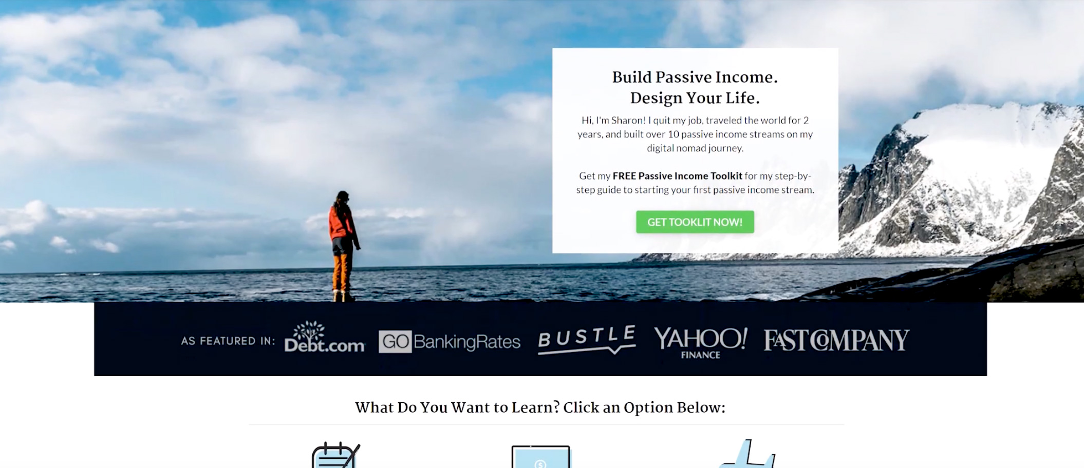
Mobile

want it to look more like this:

Can you advise?

edit: not sure if the full mobile photo is showing but if you’re able to enlargen the picture you can see that my as featured section is really small

Hello Sharon,

Thanks for writing in!

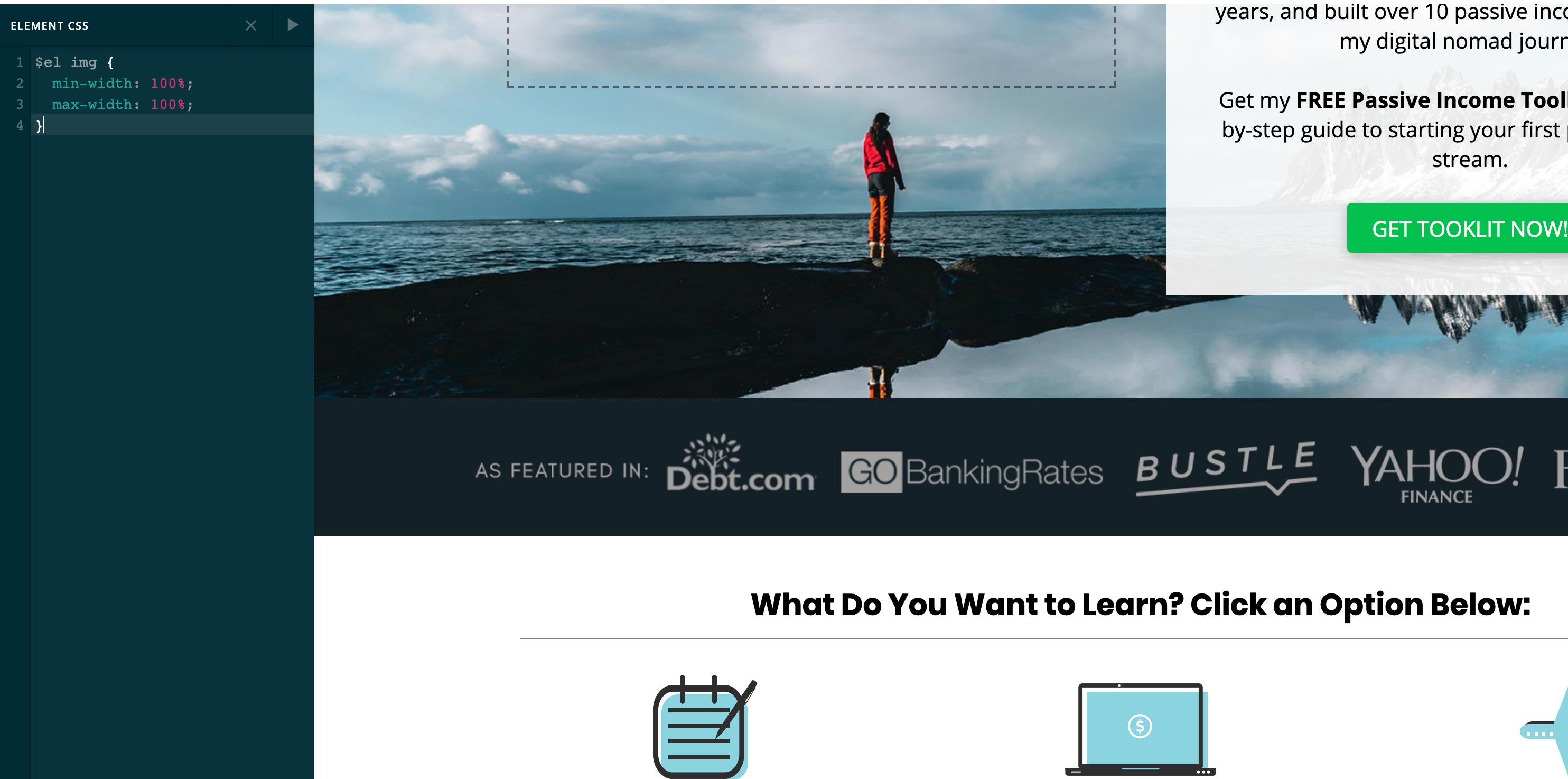
“As Featured In” is an image with 1800x150 dimension. This will not be fullwidth in screen sizes with 1920 pixels. To make this fullwidth, please edit your page, click the image element and then find the “Customize” tab. You will need to insert this inline element css:

$el img {
  min-width: 100%;
  max-width: 100%;
} 

We would love to know if this has worked for you. Thank you.

I made it work by changing the image to 1920 px but when I added the code it didnt’ do anything:

Have I done this wrong? Also want to know how to fix the mobile view - there’s a white gap and you can’t see the logos very well.

Want it to look more like this:

Hello Sharon,

You added an image:

There is no way that this image will be broken apart in smaller screens since it is an image. I would highly recommend that you edit the image, the logos out from the image as individual logo images and then add them one by one into your page.

Please let us know how it goes.

Is there any way to at least remove the top white bar above the as featured in section that shows on mobile for some reason?

Hi Sharon,

Yes. The root cause is the padding and margin. Please set margin and padding for that section to zero and then add the background color. See this: https://screencast-o-matic.com/watch/cqXoiAUYFy

Hope this helps.

Thank you!

We are delighted to assist you with this.

Cheers!

This topic was automatically closed 10 days after the last reply. New replies are no longer allowed.
