Hello
I’m working on a page with a five column agenda. On large screens 1200px wide and more it looks fine,
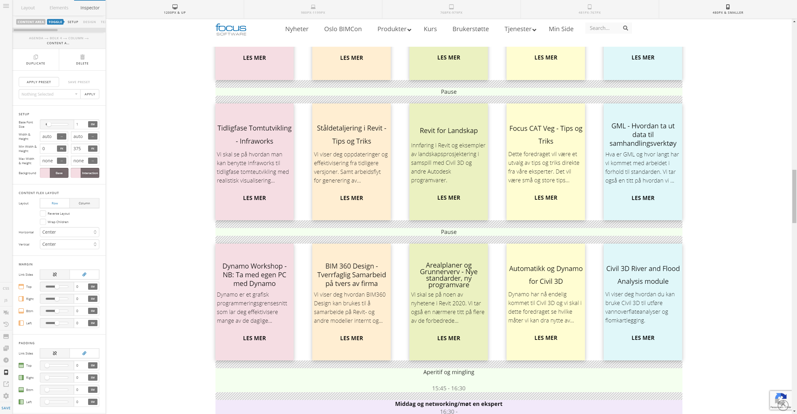
but when the screen size decreases the problems increase. I expected a true responsive design to move the blocks under each other when they become to narrow to read.
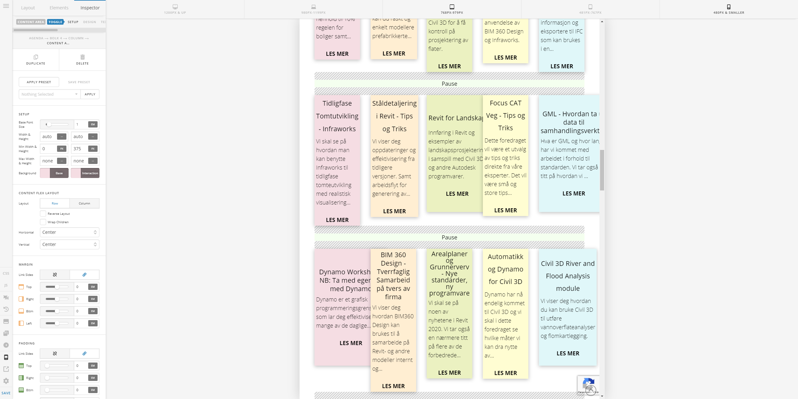
Surley the two right most columns (yellow and blue) would tuck in below the red, orange and green blocks in a truly responsive system?. The effect is also seen on screen sizes between 1200 og 768, but not as pronounced as on 768.
On very small screens, all the blocks become neat rows so that’s not a problem.