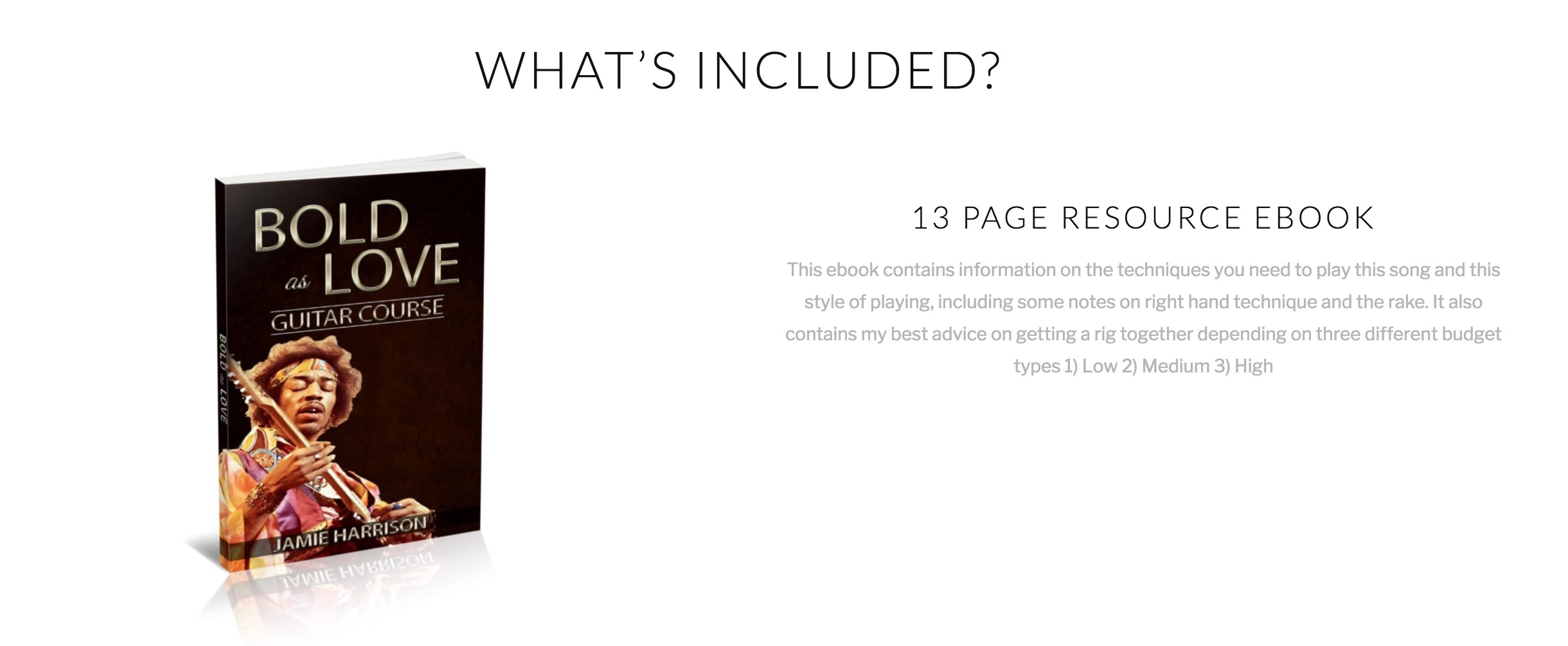
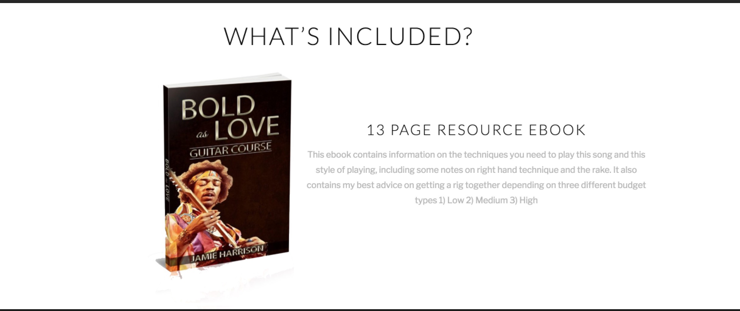
Move 2 clumns closer together

Hi

please look at my page

http://jamieharrisonmusic.com/bold-as-love-lesson/

and scroll down to the ‘whats included’ section. There you will see an image on one side and a text section on the other. I want to move these sections closer together and make them both centred on the page but with much less white space between them. Can you please suggest a way I might be able to do this?
Thanks
Jamie

Hey Jamie,

Thanks for writing in!

Do you want something like this?

If that is the case, please edit your page back in Cornerstone and in each of the row settings, find the “Customize” tab and insert an inline css max-width: 750px;

Hope this helps.

Thank you - i tried this and I have two problems -

  1. Its no longer centred
  2. The text all bunches up - I want the text to remain in the same formatting as it is here ie. same number of lines, width of lines don’t change (unless you’re switching devices). I just want to close the actual gap between the picture and text (without using absolute values in the padding section because this messes up the mobile version then.

Thanks
Jamie

Hi there,

You can increase it, and it’s only normal for the content to break into multiple lines when the container became smaller. It’s centered when I applied it, have you tried it in your row? Don’t apply it on your section’s styling and it will be aligned left.

Thanks!

No I think you’re misunderstanding.

Look at the two photos Ive attached. Instead of it looking like the first one I want it to look like the second

I did this in photoshop so you could see what I was looking for.

Hi there,

It’s doable in photoshop, if you wish to do it exactly as is then you need to create a static layout (non-responsive) and fix them all. The current layout responds to device’s screen width, it will be different from each visitor. Example, in my view, it will have smaller spaces in between, but in your view, it has bigger spaces. Responsiveness is based on percentage, where-in photoshop, they are pixel values which are fixed.

But you can try this, add float: right; margin-right:0; to the first’s column Inline CSS field.

Thanks!

This topic was automatically closed 10 days after the last reply. New replies are no longer allowed.