Modal goes offscreen on mobile

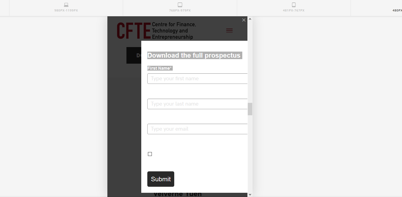
Hi, I’ve added an offscreen modal, on desktop version it seems to be working fine but on mobile version goes offscreen and also the text goes turns white, despite no styling changes being made.

http://cfte.valentin.graphics/fintechcourse/ (It’s the download prospectus button)
Hi @vlntnt,

The form in the modal is set to have a 500px width that is why it goes offscreen.

If you can change the width of the form manually through the form settings, please set the width to 100%.

You may also try adding this CSS code in X > Theme Options > CSS:

@media (max-width: 767px) {
    .x-modal-content-inner .x-modal-content #_form_1_ {
        width: 100%;
    }
}

Hope this helps.

Thank you the code worked, however the text still remains white for no reason?

Hi @vlntnt,

I have just checked and you have this code added somewhere which is setting the text color to white on mobile:

#_form_1_ ._form_element {
    margin: 0 0 20px;
    padding: 0;
    width: 100%;
    color: #fff;
}

it is under the media query:

@media (max-width: 667px) and (min-width: 320px)

So kindly remove the color set in the media query area. Or update the previous code to:


@media (max-width: 767px) {
    .x-modal-content-inner .x-modal-content #_form_1_ {
        width: 100%;
    }

    #_form_1_ ._form_element {
        color: #000;
    }
}

Hope this helps.

Thank you very, very, very much :slight_smile:

You’re welcome!
We’re glad @Jade were able to help you out.

This topic was automatically closed 10 days after the last reply. New replies are no longer allowed.