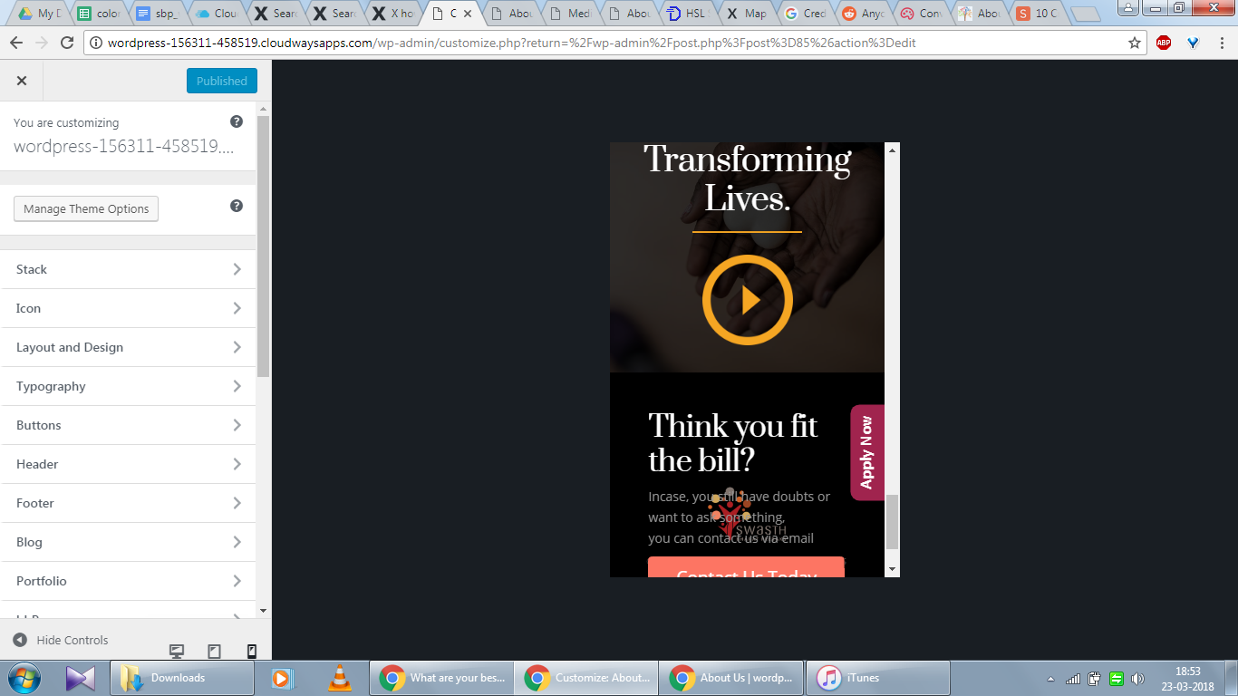
Hi i dont know why but the mobile version shows stuff irregularly. It was working fine till recently.
Please have a look.
Hi i dont know why but the mobile version shows stuff irregularly. It was working fine till recently.
Please have a look.
Hello @abheeshekj,
Thanks for asking. 
Upon testing your website on Chrome dev tools, it seems to be working fine. Please see the recorded screencast. https://cloudup.com/cfc3SXjwIIc
Thanks.
Hi Prasant, It’s on the About Us page. (The problem)
Hi there,
That is because of the negative value shortcode you have on the page:
[gap size="-190px"]
If you added the shortcode to get rid of the space between the last section and the footer of the page, try removing the shortcode and go to Theme Options > Footer > Footer Widget Areas and set to None.
Hey, that worked, but sadly it shows a lot of blank space on the desktop. On the mobile it looks fine. Anything that can be done?
Hello There,
That is also because you have added padding: 12.5%; in the row settings of the last section. Please set the top and bottom padding to zero instead. And also, the footer widget area is still displaying. Please go to Theme Options > Footer > Footer Widget Areas and set to None so that no extra spaces will be added in the footer on desktop screens.
Hope this helps. Kindly let us know.
Hi
Can you tell me what to write in the code!?
Hello there,
You don’t need to add any code. You just need to follow the steps provided by my colleague. I’ve added screenshots below for you to look at:
padding: 12.5%; in the row settings of the last section. Please set the top and bottom padding to zero instead.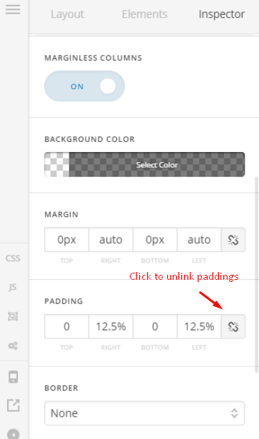
Don’t forget to click the unlink option.
None so that no extra spaces will be added in the footer on desktop screens.
Hope that helps.
This topic was automatically closed 10 days after the last reply. New replies are no longer allowed.