Mobile vs. desktop layout

Hi there

I have a page where i worked a lot with padding to style it for desktop.
For example section 5 “Modelle” --> i use a lot of padding left and right to keep the 3 columns centered and close together.

How can i style this a simple one column design on mobile so the colums go end to end and are not super narrow on mobile?

Thanks

On mobile
Hey @bakrona,

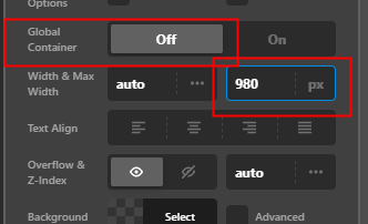
The correct option to use to contain the content on desktop is the Row’s Max Width option. The Global Container must be disabled for that option to show up.

Set a fixed Max Width like 980px.

image

Hope that helps.

This topic was automatically closed 10 days after the last reply. New replies are no longer allowed.