Hey Lydia,
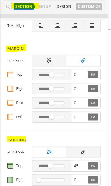
Thank you for reaching out to us. I checked your site and I believe the gaps you’re seeing is due to section’s padding and margin. Go to each of your section’s settings in Cornerstone and reduce or remove the padding and margins (see screenshot)

- To change the background color of the mobile navigation bar, try adding the following code in the Theme Options > CSS:
@media screen and (max-width: 979px) {
  header.masthead {
    background-color: #604e78;
  }
  .x-btn-navbar {
    color: #604e78 !important;
  }
}
Change the color in the above code as per your need. If you would like to learn CSS, I am sharing few resources that you take a look to get started with CSS and an interesting tool that you can use to speed up the development process.
I recommend you to watch following video that will help you to get started with CSS.
https://www.youtube.com/watch?v=MFR4WXiLzpc
Sometimes it can get a bit difficult to find out the right selector to be able to write the required CSS codes. A handy tool that can help you in this is Google Chrome dev tools. I am sharing the resource that you can refer to get started with dev tools.
https://developers.google.com/web/tools/chrome-devtools/css/
https://developers.google.com/web/tools/chrome-devtools/
https://www.youtube.com/watch?v=tP_kXBJWPhQ&t=200s
Hope this helps!
