Mobile stacking questions

Hi there,

I’m trying to tackle two mobile-related problems on http://collaborative-staging.com/casz_data/our-challenge/.

When reducing the screen width to small and extra small, two things happen.

First, the white border I have set up on left makes the image look off-center: https://www.evernote.com/l/AO6Npi9i03FGP6z_gIXk5zD-BHwwxYKQTKQ. Is there CSS I can used to not display that border at those smaller screen sizes?

Second, the stacking order gets thrown off. If you scroll down that page when resized at 481px, you’ll see that the order is this:

Text
Image
Image
Text

Whereas, it should be:

Text
Image
Text
Image

Is there a way to specify the priority of how these items stack?

Thank you for your help on both of these!
Hi there,

  • For the Image Problem:

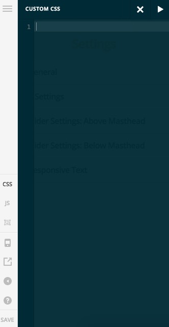
Please kindly add the CSS code below to the CSS section in Cornerstone while editing that specific page:

@media (max-width: 767px) {
#x-section-2 .x-column {
	border-left:  none !important;
}
} 

The code above restricts itself to devices which have the width of 767px or lower. Also, it selects the Section 2 column on that page and makes the left border disapear.

  • The behavior of the order you see is because how the HTML code is loaded in the page. So it loads as:

Text 1
Image 1
Image 2
Text 2

Now in the Desktop, it floats them as:

Text 1 Image 1

Image 2 Text 2

If you want to change the order you need to change the Desktop view to be:

Text 1 Image 1

Text 2 Image 2

A workaround will be to make that section item displayed as Flex and set ordering for them. It is considered as a customization which is outside of our support scope, and we just give it here as an information purpose and not a solution:

@media (max-width: 767px) {
#x-section-3 .x-container {
    display: flex;
    flex-flow: column wrap;
}
#x-section-3 .x-column.x-2-3 {
    order: 2;
}
#x-section-3 .x-column.x-1-3 {
    order: 1;
}
} 

Thank you.