That worked perfectly for almost all the views thank you!
The only views that it doesn’t work for is the iPad (768px x 1024px), iPad Pro (1024px x 1366), and Laptop (1024px x 887px).
Pictures Below:
Laptop

iPad
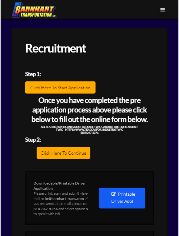
iPad Pro
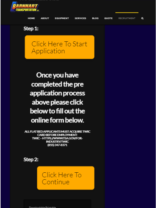
This is my current code:
@media screen and (max-width: 979px) {
    .entry-wrap .x-container.max.width {
        width: 100% !important;
    }
    h1, h2, h3, h4, h5, h6, .h1, .h2, .h3, .h4, .h5, .h6 {
        margin-top: 0 !important;
    }
    .x-anchor-button {
        font-size: 20px !important;
        margin-left: 0 !important;
      	text-align: center !important;
    }
  .el9.x-anchor.x-anchor-button
  {
    	margin-left: 9% !important;
  }

  .x-text {
  		font-size: 14px;
  }
  .h-custom-headline.cs-ta-center.h6 {
    	font-size: 12px;
  }
}

/* Desktop and Laptops */
@media only screen and (min-width : 1025px){
  .x-main.left {
  margin-left: 12%;
}
  .post-342 {
  width: 110%;
}
  .el9.x-anchor.x-anchor-button {
    text-align: center;
  }

  .el5.x-anchor.x-anchor-button {
    text-align: center;
  }
}
Any help?

