The mobile version of a website I’m working on is an absolute mess. I don’t know what’s going on with the responsive parts of it, but they don’t seem to be working. I’ve looked at various tutorials, and either they’re outdated, or I can’t find the options to customize (in particular, I can’t find class and style options for some of the elements)
My site: http://www.i-dohc.com
Hello @stimofeev,
Thanks for writing in!
I am unable to load your website on my end. Here is the message I am getting:
This site can’t be reached
www.i-dohc.com took too long to respond.
Can you please confirm?
Thanks.
Maybe try a different browser? Worked for me on both chrome and safari
Hi There,
I think your site can only be accessed in selected countries/IPs, that is why my colleague was not able to access your site.
Anyways, are you referring to the overflowing headline and button, and the huge space on the sides of your sections when viewed on mobile? That is because of the huge padding you applied to the sections.
Please reduce your sections’ left and right padding (maybe not more than 20px).
If you want to limit your container width, please set a max-width on your ROW instead.

Hope it helps,
Cheers!
It definitely has helped some by taking off the padding, but I don’t get that width/max width option you have. This is what it looks like for me on the row:
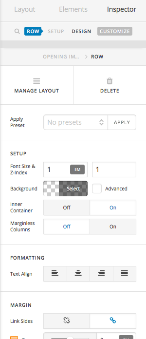
Clicking advanced doesn’t give me the width/max width option either.
It also doesn’t solve the original issue of the text being too large.
Hi There,
Sorry I forgot to mention, in the screenshot please turn off the Inner Container option to get the width/max-width option.
Cheers!
Thanks, I can now see that option. The mobile version is definitely looking a lot better.
However, by taking off the inner container option (which definitely makes the header look better in the mobile), the text becomes too wide on the desktop version. I’d like it to be the same width as the other text that have the inner container option on.
Also, adding the max width pushes the text to one side, where I’d like it the text to be aligned to the left but centered on the page.
See below…
(text pushed to side)

Correct me if I’m wrong, but I feel like keeping the inner container option but just adding a class to that header text to scale it down for mobile would be simpler and the better version to go with. There’s so many options for this template though, that I could very well be wrong.
Hi There,
Ok, please turn back on the Inner Container option of your ROW, then set your TEXT element’s max-width to 600px (or where you see it fits) and then set the left and right margin to auto
Yes, you can do that using the Responsive Text Settings

Apply the selector as a CLASS to your Text element, then play with the compression, mid-size, and max-size until you get the desired look.
Cheers!
1 Like
Thanks for the help so far - really appreciate it.
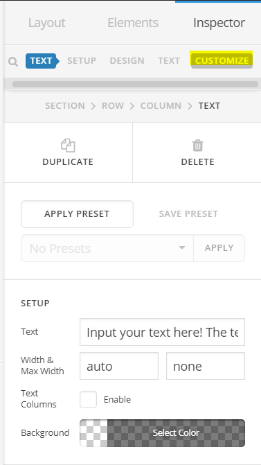
I’ve set a responsive text settings, but my problem is that in my text element, I don’t have the id, class or style options and I have no idea why.
Hi again,
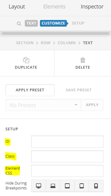
In your text element, click on Customize tab in the topbar (see screenshot)
Once you’re in the Customize tab, you’ll be able to see ID, Class and Element CSS options (see screenshot)
Hope this helps!
Awesome - I couldn’t find anything online showing the new place the class and id are. Thank you!
However, I’m still have a problem with the text being too large on phones. I’ve set minimum size to a ridiculous 3px in responsive text settings, but it doesn’t shrink down for phones. It shrinks down when I size down my computer browser window (though still too large), but not on my phone (or in preview, for screens 480px and smaller).
Hi There,
Unfortunately, I am still unable to load you site like the other staff.
Responsive settings may not work because of CSS precedence specially when using text element. The content on text element is wrap by a container. Font size is then applied directly on the container. Content on text element might be paragraph tag <p>text</p> or headings tag <h1>header here</h1>. There might be more specific CSS that is affecting those tag. It’s overrides the responsive text settings.
Other option is, the set font size directly using media query. On the ID field of the element, try adding, my-responsive-font.
@media (max-width:767px){
#my-responsive-font h1{
  font-size: 22px;
}
#my-responsive-font p{
  font-size: 15px;
}
}
@media (max-width:480px){
#my-responsive-font h1{
  font-size: 18px;
}
#my-responsive-font p{
  font-size: 12px;
}
}
On that CSS, see how I targeted the tags directly on different screen.
Hope this helps.
My text does have the header tag. I’ve never used media query before, so forgive me if some of the following questions don’t make any sense:
Do I apply the code you provided to the container column ID field or to the text element ID field? Do I need to change any of that code to be specific to my text?
When I added the code (as is) to the container column ID and text element (both separately and then together), it didn’t change anything.
Hi there,
Yes, you will have to add the ID to the container’s ID field element. You can modify the ID but you will have to modify the CSS given to match the new ID.
You have to add your CSS to global custom CSS and not to column’s ID field. Would you mind providing some screenshots of how you added it?
Thanks!
Success! Text is sizing down appropriately now! Thanks all for the help!
You are welcome!
1 Like
This topic was automatically closed 10 days after the last reply. New replies are no longer allowed.