Mobile Responsive Issues: Home Page

I’m having trouble with mobile responsiveness on my homepage in particular.

http://galandgeezer.wpengine.com/

Here’s a few of the issues:

  • Hero image is cropped, it doesn’t resize at all.
  • Layout is all messed up
  • Dropdown menu in top right corner doesn’t have working links. Also appears to have pages in the drop down menu that aren’t in the web view of the menu.

How do I fix these issues? Am I missing a setting that is causing them not to be mobile responsive?

The menu dropdown is broken across the site, but it appears all the other pages are scaling correctly.

Thanks!

I was able to get the menu to work on the Home page on mobile. However, it’s not working across all pages. The other pages still show the sample header, though I changed it in the remaining pages.

Menu works across all pages if I resize a Chrome Browser tab, but does not work on mobile for some reason.

Hi there,

Thanks for writing in! I checked your site and I see you’re using an outdated version of Pro, please update your theme and plugins to latest version first as many bugs have been addressed in the latest releases. You can find the latest version numbers here: (http://theme.co/changelog/) Then you can compare them to what’s installed on your site.

If you find anything to be out of date, you can review our update guide

  • For the hero image, please set the background-size to cover currently it is set to 94em and background position to center

  • Layout issue you’re having is mostly due to the large amount of padding and margin set. Please review all of your elements on homepage especially text elements and remove all negative margins and extra padding to fix the layout issue.

  • Make sure you’ve assigned the menu in all of your headers. Better option would be to use one header and make it global. For example the header used on your homepage can be set to global header (for all pages)

Hope this helps!

Thanks Nabeel, I made the changes on the hero image, & while it does scale down a bit, it’s still not fitting on the screen on mobile. Thoughts on how to fix this?

And I made the changes to the header & they’re now working correctly. I’ll work on updating the text margins/padding on the home page so that they line up correctly. Thanks for the help.

Hey @Williamsps1,

This is because you used your image as a background. Generally, the background image is good for images that don’t have information or will only be used for decoration. That is because of the difference of the screen’s aspect ratio to your image. In desktop, the aspect ratio is commonly 16:9 landscape. In mobile, that aspect ratio is flipped. For more details, please learn from the conversation from this thread https://theme.co/apex/forum/t/how-to-always-display-a-full-width-background-image-on-any-screen-size/40612/12?u=christian_y

I’d recommend that you use an Image element instead.

Thanks.

How do I use an image element?

Can I still get the hero image look similar to what it is now on Desktop?

Hello @Williamsps1,

Thanks for updating the thread.

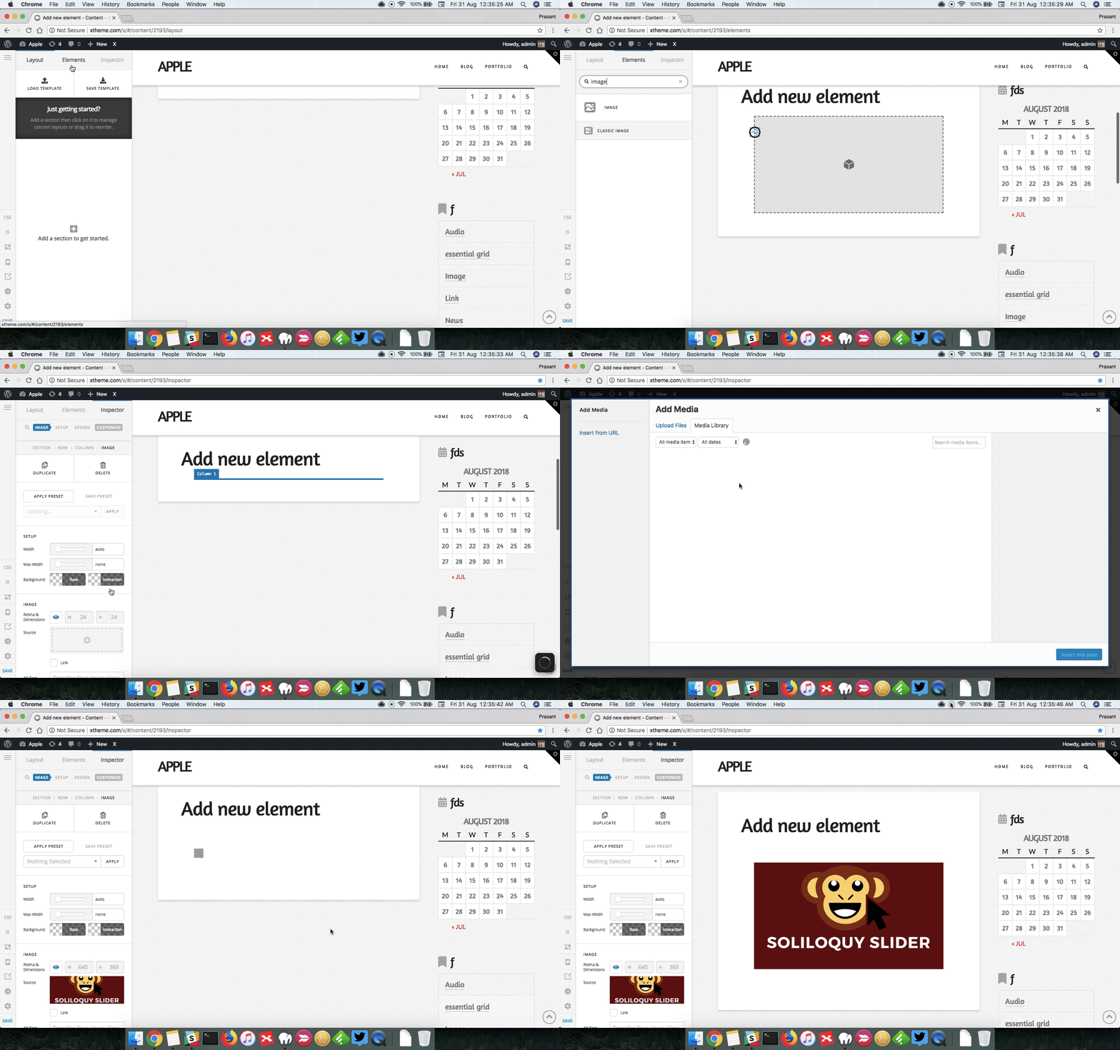
You can add the Image Element from Elements tab under Cornerstone builder. Here’s a screencast that you can take a look.

Thanks.

Can I add it to the header? Or do I need to just add it to the first page?

I’d like to retain the look of having a hero image.

Hello There,

When you edit your header, you should be able to insert an image element for your header. This is very much applicable to your site since your hero image is in the header and not in the page content. Just make sure that you know the difference of the image element and background image which is the way hero image were constructed. With the image element, you won’t be able to control the extra spaces in the left or right of the image element. Unlike with background image, no extra space though the background image will be scaled and positioned to cover the whole hero container. I would advice that the background image will just be the old lady. The texts should be in a different layer or by using a text element on top of it.

Hope this make sense.

Thanks, I will try this out and see if I can come up with something that looks good & scales!

Let us know how it goes, Thanks.

This topic was automatically closed 10 days after the last reply. New replies are no longer allowed.