Mobile Rendering Problems

I’m having 2 problems with mobile rendering:

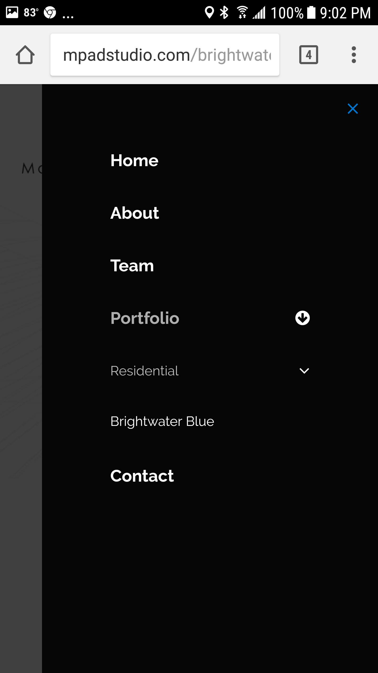
  1. My navigation menu goes 2 children deep in the Portfolio section, each with 3 children of the sub-parent. However, only 1 child link is visible on mobile. (see attached screen cap)
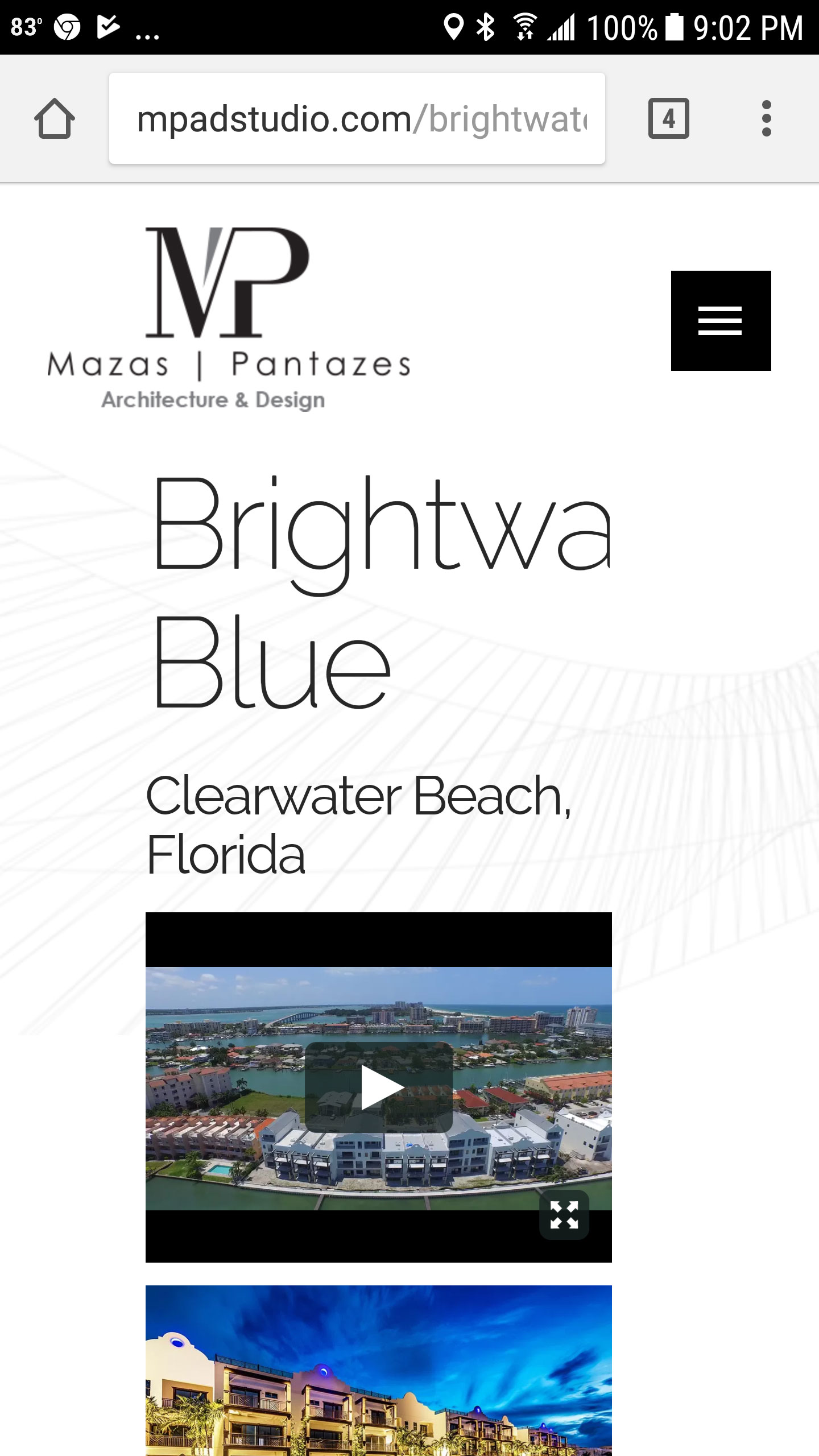
  2. My titles are getting cut off on mobile. (see attached screen cap)
Hi There,

1.) We’re sorry for the inconvenience this has caused you. This is a confirm bug and we have forwarded this issue already to our developer. We will let you know once we have an update. For the mean time, please try this custom CSS fixed:

[data-x-collapse="opening"]>ul.sub-menu {
    overflow: auto !important;
    height: auto !important;
}

2.) Please try to use responsive text for titles to adjust on screen size.

Hope this helps.

Thanks that seemed to fix the menu collapsing issue. However, in my first screen cap, you’ll see on the Brightwater page that the heading text is cut off on mobile. How do I get it to wrap or shrink on mobile?

Hello There,

I have seen your site in a mobile screen. The headings are quite big enough and this is why it is cut off. You may need to apply Responsive text and manage it in Settings > Responsive Text. To know more about responsive text, please check it from our knowledge base here:
https://community.theme.co/kb/shortcode-walkthrough-responsive-text/
http://demo.theme.co/integrity-1/shortcodes/responsive-text/

Hope this helps. Please let us know how it goes.