I RESOLVED THIS ISSUE:
I’m getting two different results for the page when looked at inside the editor or on an actual mobile device. Any ideas?
Mobile device:

Desktop editor:

I RESOLVED THIS ISSUE:
I’m getting two different results for the page when looked at inside the editor or on an actual mobile device. Any ideas?
Mobile device:
Desktop editor:
Glad to hear you got it sorted.
Cheers!
Ok, this is related to mobile spacing so I’m going to continue this here.
How do I make two columns on mobile for this section here?
Hi,
To achieve that you can add a class to your section.

Then add this in Cornerstone > CSS
@media (max-width: 767px)
body .x-section.my-section .x-column {
    float: left;
    width: 48%;
    margin-right: 4%;
}

body .x-section.my-section .x-column:nth-child(even) {
     margin-right: 0;
}
}
Hope that helps.
Hi - That did not work when wrapped in the media tag. Is that because I’m looking at the editor on desktop with a sample view of mobile in the cornerstone editor?
Hello there,
To follw up, it’s because there was just a missing tag {.
Please update your code to:
@media (max-width: 767px) {
    body .x-section.my-section .x-column {
        float: left;
        width: 48%;
        margin-right: 4%;
    }

    body .x-section.my-section .x-column:nth-child(even) {
        margin-right: 0;
    }
}
Thank you.
Thank you, that worked!
Now, out of nowhere, the header on mobile is not abiding by the settings and I can’t figure out why all of a sudden it changed. It has the EXACT same settings as the scrolling menu…
A huge right and left margin appeared out of nowhere:

it should be tighter like this:

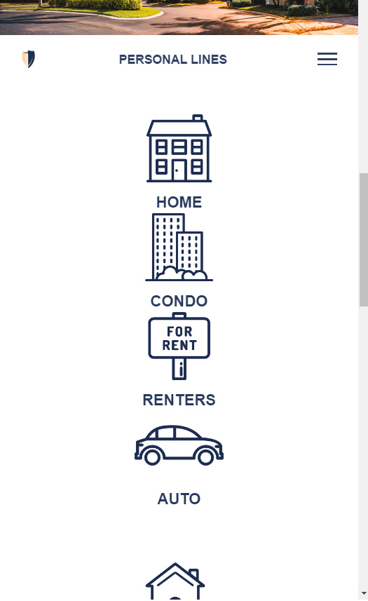
The .x-section CSS above worked great in one area of my mobile website, on the personal-lines page.
Now, on a different page (business-insurance), I’m not able to keep a consistent background while having a headline in the same section that goes full width. See below. I want Example Industries We Insure to go full width, but keep the icons below in 2 side by side columns. Any ideas?:

Nevermind - I duplicated the CSS and replaced the word “Section” with “Container”, then removed the section custom CSS and added the custom container CSS at the row level.
It’s working great now, thanks.
Glad to hear you got it sorted.
Cheers!
This topic was automatically closed 10 days after the last reply. New replies are no longer allowed.