I have a row with three columns in it. When the screen shrinks down to mobile view the columns stack on top of each other
Is it possible to stop the columns stacking so the mobile view still has 3 columns in the one row?
Hi There,
Thank you for writing in, you said 3 columns but I am seeing 4 columns. Or maybe you’re referring to the 3 recent posts below the 4 columns? Please clarify.
If it is the 4 columns, please add this to Theme Options > CSS
@media (max-width: 767px) {
	.stay-inline .x-column.x-sm {
	float: left;
    width: 22%;
    margin-right: 4%;
	}
	.stay-inline .x-column.x-sm:last-child {
	margin-right: 0;
	}
}
Then apply the CLASS stay-inline on the Section where those 4 columns are placed. Just keep in mind that when you do this (forcing columns to be inline) your content might look really squeeze on small screen devices.
Hope it helps,
Cheers!
Thanks for that code. I modified it a bit to getb 2 columns on mobile but ended up with what you see in the pic
Is it possible to get the columns to slide up and fill in all the blank spaces? and also the margin on the right should be equal to that on the left. the code I used is below.
@media (max-width: 767px) { .stay-inline-2 .x-column.x-sm { float: left; width: 46%; margin-right: 4%; } .stay-inline .x-column.x-sm:last-child { margin-right: 0; } }
Would be great if you could solve this problem.
Hi There,
Thank you for the reply, regretfully you can not make a 1/3 column row a 2 by 2. Because we can not merge the columns in a separate ROW, the result is the last 1/3 column will be an odd just like in your screenshot.
You might want to create a separate section for mobile instead and utilize the Hide During Breakpoints feature.
Cheers!
thank, thats a good idea. just wanted to clarify the dimensions. Will have a 2 column setup on mobile so should i set it to 46% width, 4% margin, not sure how to work those out, I think they have to equal 100%
Hi There,
There is no need to set for custom width and margin, make your mobile section 2 columns right from the start.
Thanks,

I did not know it was possible to make a 2 column section in mobile view. I have never been able to do it. As you can see if I try to create a 2 column section they just stack on top of each other. Are I missing something here?
Hi there,
I see what you mean. To override that behavior you will need to click on the magnifying glass icon of the section in question and click on the Customize tab and add the nobreak class:
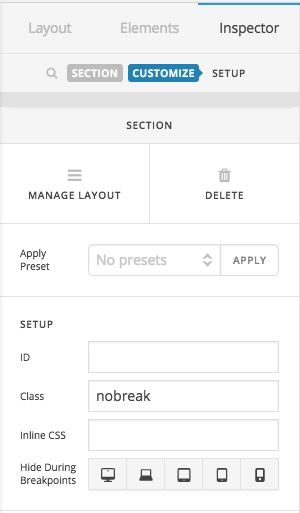
Then add the code below to X > Launch > Options > CSS:
.nobreak .x-column.x-sm {
    float: left;
    width: 48%;
}
That should do the trick. Thank you.
This topic was automatically closed 10 days after the last reply. New replies are no longer allowed.