I can’t figure out how to make the page content full width on mobile. I must have set something wrong at some point. I tried to add this global css but it didn’t help:
@media (max-width: 480px) {
.entry-content {
padding: 0;
}
}
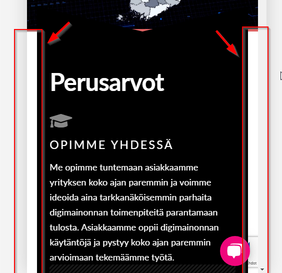
I can’t figure out how to make the page content full width on mobile. I must have set something wrong at some point. I tried to add this global css but it didn’t help:
@media (max-width: 480px) {
.entry-content {
padding: 0;
}
}
Hi Ville,
Thank you for writing in, I see you have this custom CSS block on Appearance > Customize > Additional CSS
@media (max-width:480px){
	.x-main.full{
		padding:0 20px;
	}
}
This is the culprit of that mobile width issue, please remove or alter it.
Hope it helps,
Happy holidays!
I had totally forgot that piece of CSS - thank you, removing it solved the problem 
You’re always welcome Ville!
Cheers.
This topic was automatically closed 10 days after the last reply. New replies are no longer allowed.