Mobile Navigation Collapse on clicking

I have a website:

And when viewing on mobile the menu obscures the content.

This is a single page scroll with one page navigation enabled.

All of the links work properly on the page.

I would like the menu to collapse each time a link is clicked so the user can see the content beneath.

Or alternatively, is there a way to add a “Close” (X) icon - link as the last link in the navigation?

Thanks for your help.

Mark

Using:
Cornerstone 2.17
XTheme 5.2.5
Hi There,

Thanks for writing in!

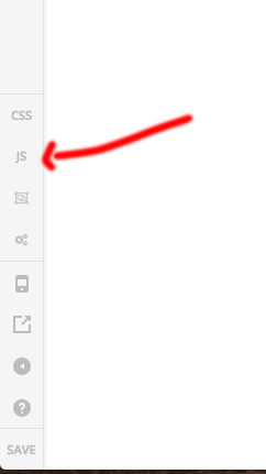
Can you please add this js to theme option - > Js and let us know how this goes.

jQuery( document ).ready(function() {
    jQuery('.x-nav-scrollspy a').click(function(){ 
      jQuery('.x-nav-wrap').removeClass('in');
    });  
 });

Hope this helps.

Thanks

Hi thanks for the code!

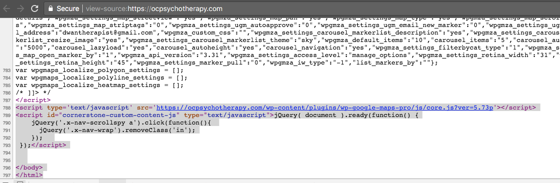
I installed the code, emptied the cache, and confirmed it is showing in the HTML source:

bottom of page
…

Unfortunately nothing changes, the menu remains open when clicked.

Is it possible that you are assigning to the wrong menu css class? My navigation does not have an instance of .x-nav-scrollspy anywhere in the source code.

view-source:https://ocpsychotherapy.com/

thanks

So looks like I do see instances of x-nav-scrollspy in the source but still the code is not working on a mobile device or a mobile simulator.

If I squeeze the desktop browser window to trigger mobile nav then the jquery works.

So this must be a different event type click versus touch? Which event type do I use?

jQuery( document ).ready(function() {
jQuery(’.x-nav a’).on(‘click touchend’, function () {
jQuery(’.x-nav-wrap’).removeClass(‘in’);
});
});

Hi There,

This code looks good:

jQuery('.x-nav a').on('click touchend', function () {
jQuery('.x-nav-wrap').removeClass('in');
});
});

Regards!

This topic was automatically closed 10 days after the last reply. New replies are no longer allowed.