Hello,
For some reason my nav menu displays boxed X characters next to the nav text. This does not display on desktop. How can I fix?
Cheers,
DB
Hello,
For some reason my nav menu displays boxed X characters next to the nav text. This does not display on desktop. How can I fix?
Cheers,
DB
Hi There,
Did you want to add an icon next to your menu items?
So please find this custom CSS:
body .x-navbar .x-nav li>a>span:after {
    content: "\f13a" !important;
}
And change to this:
body .x-navbar .x-nav li>a>span:after {
    content: "\f13a" !important;
    font-family: "FontAwesome";
    margin-left: 5px;
}
Let us know how it goes!
I don’t need an icon there at all, so just removed the code for now. I’ll keep the updated code on-hand for if I need to add an icon in the future. THANK YOU!
Hello @derekbritton,
In that case can we assume that your question is answered? Please let us know.
Thanks.
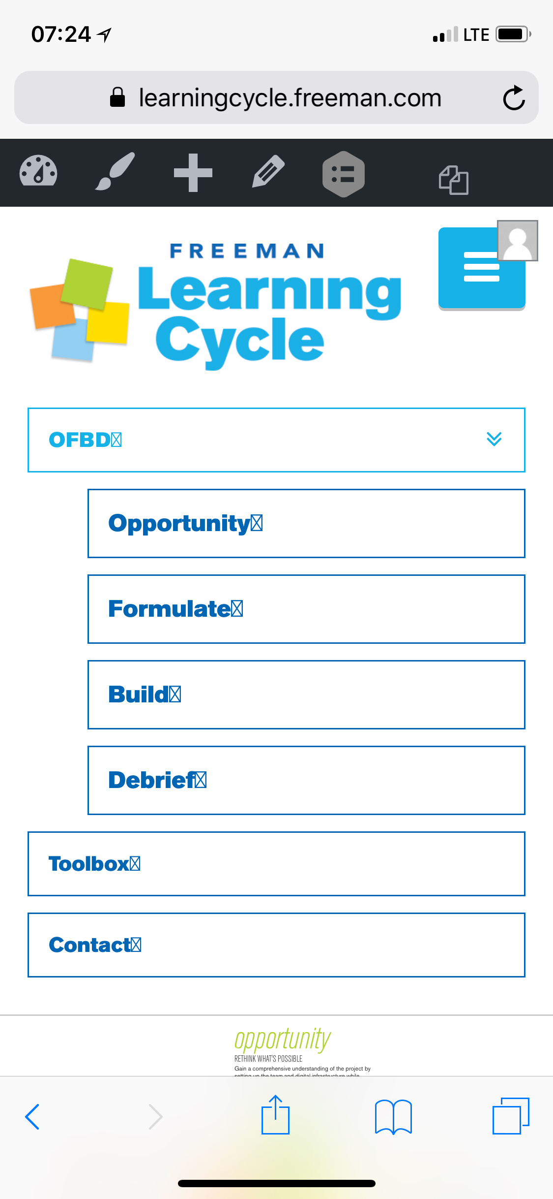
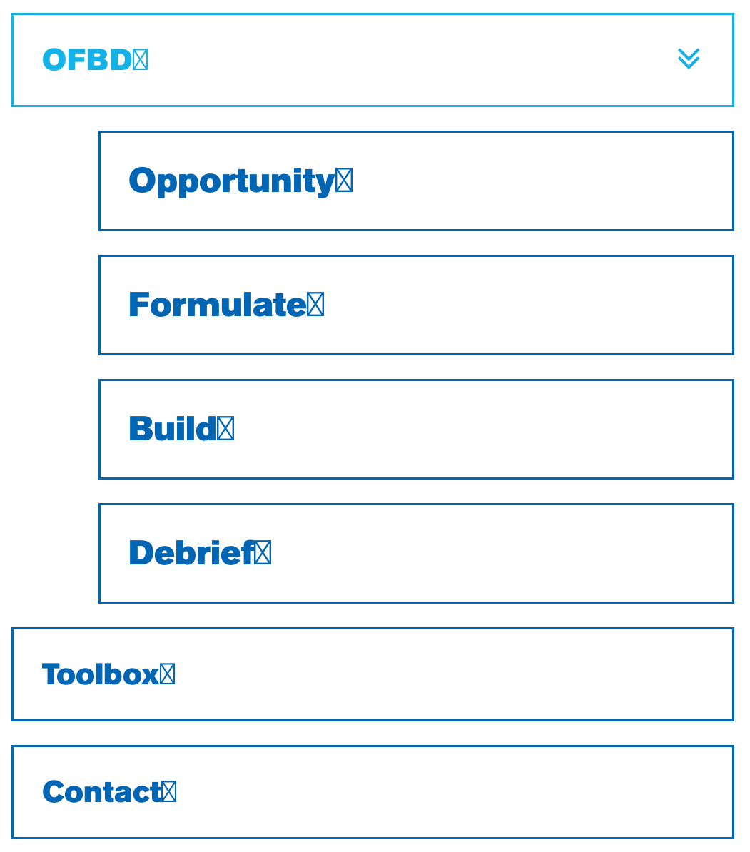
Thanks for double-checking. Now that I’ve removed the code, I’m realizing the issue a little more clearly.
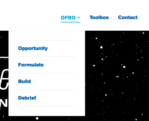
The desired behavior I’m looking for is to have the chevron-circle-down icon for the menu items that have sub-menus (currently only the OFBD menu) and no icons for menu items without sub-menus.
Now that I’ve removed the code above, the OFBD menu has a double-arrow character to indicate it has a sub-menu (as pictured below). How can I make it so only the OFBD menu has the chevron-circle-down icon?
Cheers,
DB
Hi again,
To achieve this please add the following code in your Child Theme’s style.css file:
.x-navbar .desktop .x-nav li.menu-item-has-children>a>span:after {
    content: "\f13a" !important;
}
Let us know how this goes!
This worked great - all set. Thank you!
Glad we could help.
Cheers!
This topic was automatically closed 10 days after the last reply. New replies are no longer allowed.