Mobile modal menu offscreen with Pro header builder

For my mobile menu, when the modal pops up, it is offscreen. It looks fine in the Pro previewer, but when actually viewing on my mobile device, it’s cut off (see screenshot.) Any help would be greatly appreciated!
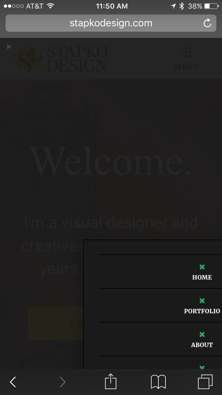
Latest version of everything. Using Pro. Here is the site:

Thanks!

Katie

Hi There,

It looks good on my end on which browser and device you are using while experiencing the issue?

Let us know

Thanks

Hi Joao,

Thanks for the reply. I switched it to the left side and it wasn’t getting cut off, so that works for me for now. Thanks again!

Hi There,

Glad it is is working for you now. In case you want us to check further, we need to see the issue directly. Just let us know and we will be happy to investigate.