Mobile Menu Style Issue

I have been having difficulty replicating the mobile menu found on this demo theme: http://demo.theme.co/bed-and-breakfast/

All the preset nav dropdown options make the menu appear layered on top of the hero image, rather than pushing it downwards and appearing in the same layer. I can’t find where to change this in the customizer and all of the support posts that requested similar menu styles have css code that doesn’t change anything for me.

Thank you for the help.
Hi There,

That might happen if the menu is fixed. It will overlap on current content and not push other content down. By default, menu is not fixed on mobile and will only be fixed when you add custom JS code or CSS. I want to confirm the issue but you need to share us your site URL. Thank you.

See note below

Hi there,

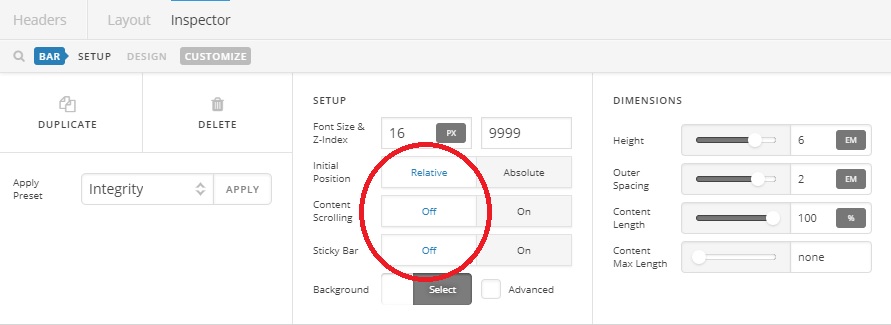
You will have to apply the background color to your header bar, then set its position to relative instead of absolute.

The preset only represent the stack and not the demo, preset is just a starting point and you still need to customize it to achieve your target demo.

Thanks!

This topic was automatically closed 10 days after the last reply. New replies are no longer allowed.