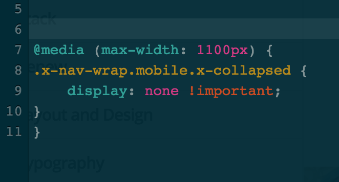
Sadly you closed my old thread … it’s still not fixed.
Please see here on our staging website that when you view it in e.g. 1024 x 1366 (iPad Pro with Google Chrome Tools) the mobile menu is opened and it isn’t possible to close it. On lower resolutions (e.g. iPhone) everything’s fine (mobile menu closed and “burger button” is working).
Any help for this would be great! Thank you!