Mobile menu one page navigation not hitting anchor

Hi,

I am using the scrolling script provided by Nabeel to overcome the Chrome bug with one page navigation.

It works perfectly on desktop widths, but the mobile menu doesn’t quite hit the right section. This happens in all browsers.

When the menu is active and the link is clicked, it goes to the right area, but the headline text that is contained within the section with the anchor URL is too high, meaning it can’t quite be seen.

Any idea why this is happening? Site is currently under construction, so login details copied below.
Hey Michael,

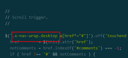
That old script conflicts with the working mobile scroll and header offset. I mean, it’s only the desktop scrolling is having the issue right now so the old code was suggested. With that said, I modified the code to target the desktop links only. Now mobile offset is not affected by that code.

This issue might get fixed in the next release so don’t forget to remove this old JS code from your site when you update.

Hope that helps.

That helps a lot, thank you!

You’re welcome!
We’re glad @Christian were able to help you out.

This topic was automatically closed 10 days after the last reply. New replies are no longer allowed.