Mobile Menu - Odd Movement

On mobile, my menu on most all pages except my homepage work properly. I was wondering if there was a way to fix it?

If you go to my homepage below you can see how it compares to my about page

I’d like to keep the way it looks with the button on top of the photo on the about page, but I want the menu to function properly

www.bravepandacreative.com/about

Hi There,

I can see on your home page you have a background in the header whereas another page having no background and it comes above the image.

to make the layout on every page please remove the custom class you have with a -ve margin or you can reduce the value to 100px instead of 180px.
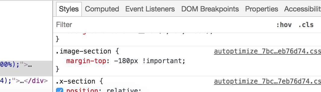
After that please add this CSS to your theme X -> option global -> global CSS

@media (max-width: 979px) {
.home .masthead.masthead-inline {
    position: absolute;
    width: 100%;
}
#x-nav-wrap-mobile ul.x-nav {
padding: 10px !important;
background: #333 !important;
}
}

Remember, this customization won’t push the content when the menu opened. It will overlap the content.
If you want to do the content pushed, you need custom development for this. Which is beyond our theme support scope.

Thanks
This didn’t seem to work for me. It messed up the top of my homepage. I reverted it back to what it was prior. I’d like every page to look like my about page, but when you push the menu, you can actually read all the menu items. If that isn’t possible, I’d like it to look like my homepage on - grey top with logo and when you click the menu, it pushes the rest down so you can see all the menu items. Any suggestions on how to do that?

Hi There,

Thanks for your confirmation!
I can see there is a CSS

@media (max-width: 979px) {
.home .x-navbar {
    background-color: #ccc !important;
}
}

Please remove the class .home from the CSS it will affect to all of the other pages including the home page.
I after the change please clear cache.

Hope this helps!

This topic was automatically closed 10 days after the last reply. New replies are no longer allowed.