Mobile menu not showing on iphone and ipad

Hi there

First, I’m a non-coder, so be gentle with me.

Second, the menu to my website - lifelovereiki.com - appears fine on my Mac desktop, with the correct styling, but doesn’t appear at all on my iphone 6s or my ipad. If you (accidentally!) touch and press the empty space between the logo header and the first line of text where the menu should be, it suddenly appears - but in the X theme styling. What I mean by that – I don’t like the grey bars and so removed them; happily, they don’t appear on the desktop version.

So to clarify, why does the menu not appear as part of the website on the iphone/ipad? Why do you have to press on the empty space to make the menu appear? Finally, why, when it does appear, does the menu have a different styling to the desktop version?

Many thanks

Lorraine

PS I’m using X theme/Cornerstone on Wordpress.
Hi @Lozziella,

Thanks for reaching out.

You mean the header background color was gray and you changed to white? It’s the same header for desktop and mobile so changing it will take effect on both. But, it’s not the issue, the issue is the toggle is white which will appear hidden on a white background color. To fix that, please add this CSS to your global custom CSS

.x-btn-navbar.collapsed:hover, .x-btn-navbar:hover {
    color: rgba(0,0,0,0.5) !important;
}

.x-btn-navbar.collapsed {
    color: rgba(0,0,0,0.35) !important;
}

Hope this helps.

1 Like

Thanks, Rad. Do you mind explaining exactly where I need to place this Css?

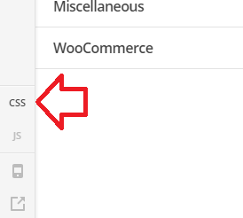
Don’t worry. I’ve found it. For anyone who is also wondering where to put the css, from the WP dashboard, go to Appearance - Customise - Additional CSS

And it seems to be working. Thanks!

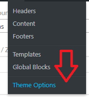
Glad it’s working now. It can be added to Theme Options > CSS too (global CSS).

Cheers!

This topic was automatically closed 10 days after the last reply. New replies are no longer allowed.