Hi,
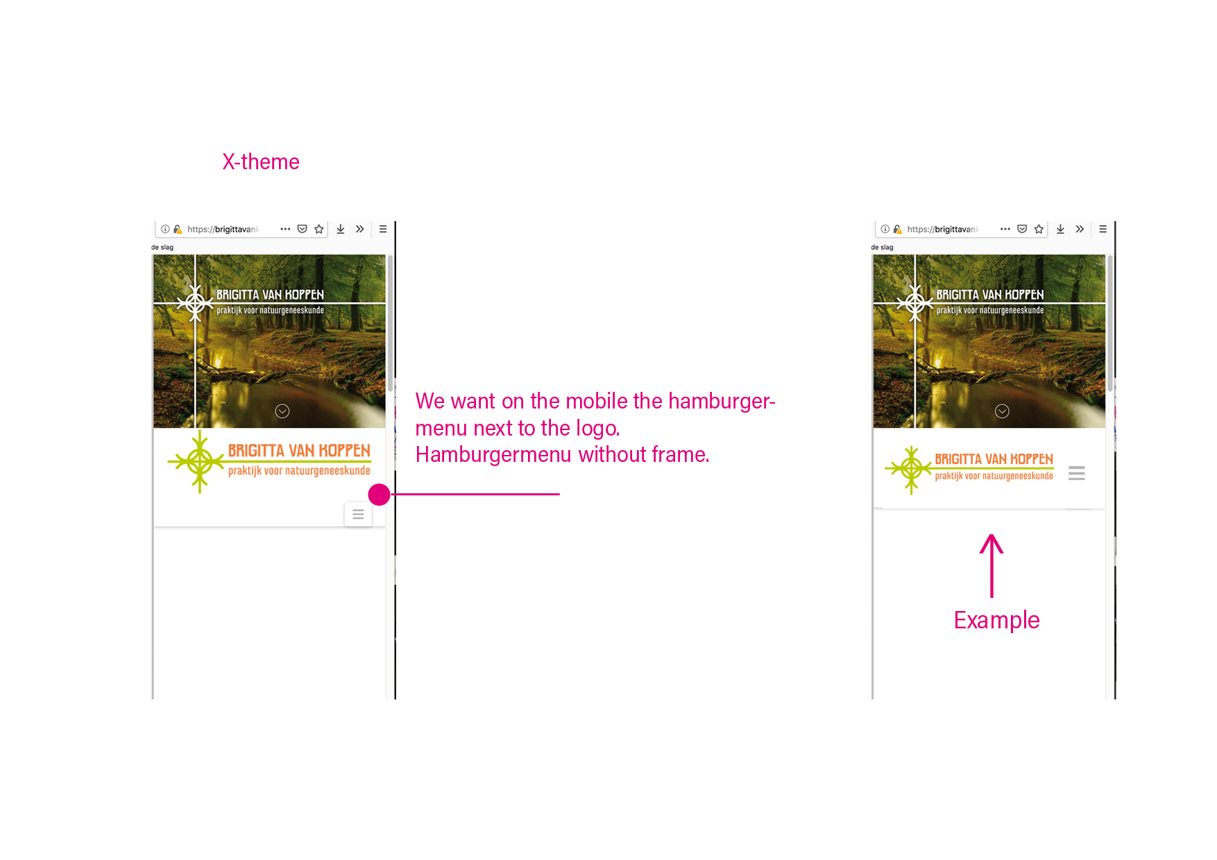
We want on the mobile the hamburgermenu next to the logo.
Hamburgermenu without frame. See attachment.
Carla
Hi,
We want on the mobile the hamburgermenu next to the logo.
Hamburgermenu without frame. See attachment.
Carla
Hi Carla,
Thanks for reaching out.
And sure, it’s possible. But since your site is behind an under construction page then I’ll provide the fix that you can adjust. Please add this CSS to Theme Options > CSS
@media ( max-width: 768px ) {
.x-brand img {
    width: 100px;
}
}
.x-btn-navbar.collapsed {
box-shadow: none !important;
}
Please adjust the 100px to your preference.
Thanks!
THANKS!!!
You are most welcome!
This topic was automatically closed 10 days after the last reply. New replies are no longer allowed.