So the menu on my mobile doesn’t seem to function properly. When I select the hamburger menu, it doesn’t push the content down, but instead, it lays on top of it so it’s hard to read. Anyway we can change this?
theopendoor.church
So the menu on my mobile doesn’t seem to function properly. When I select the hamburger menu, it doesn’t push the content down, but instead, it lays on top of it so it’s hard to read. Anyway we can change this?
theopendoor.church
Hi Brock,
Thank you for reaching out to us. This is happening due to the custom CSS you’ve added in the theme. Please find and remove the following code to fix the issue:
.masthead {
    position: absolute;
    width: 100%;
}
After removing the code please make sure to clear cache of autoptimize plugin so you can see the changes on the front-end right away. Cheers!
The issue is, if I remove that code, it looks like the image I attached. How do I prevent that.
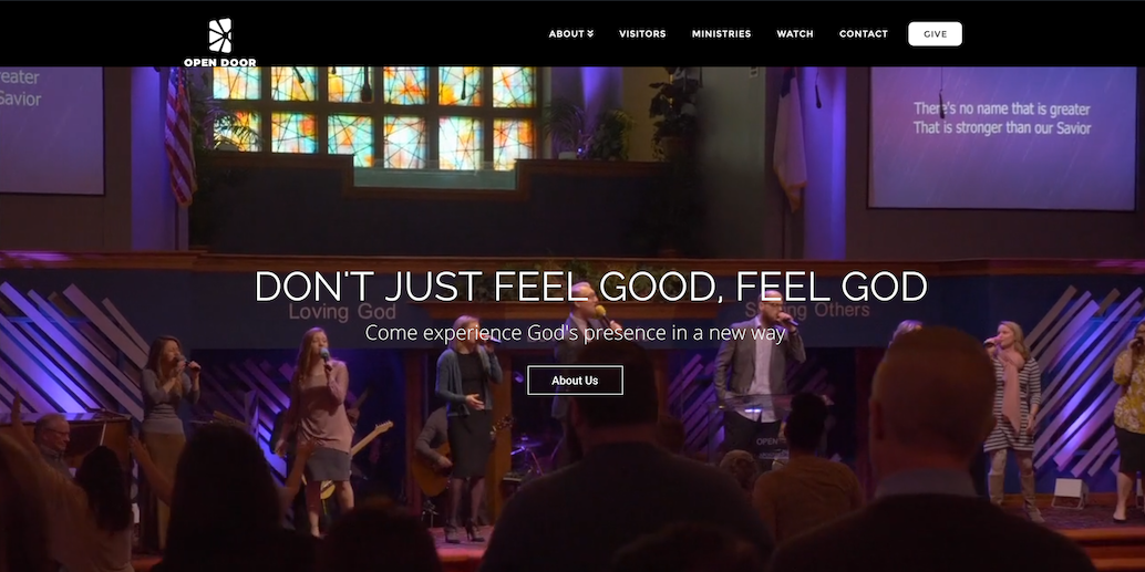
Hello Brock,
If that is the case, please have the code updated and use this instead:
@media(min-width:980px){
    .masthead {
        position: absolute;
        width: 100%;
    }
}
The masthead will only be positioned as absolute in larger screens. In mobile, it goes back to normal thus the content will push downwards as you click the mobile menu.
Hope this helps. Please let us know how it goes.
This topic was automatically closed 10 days after the last reply. New replies are no longer allowed.