Hello. I have two issues.
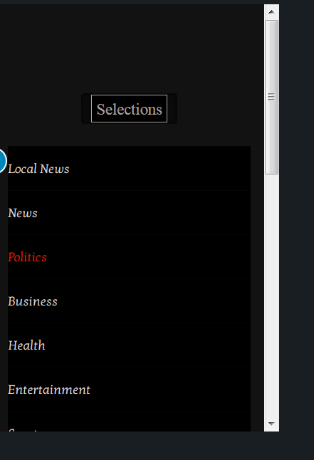
- My mobile navbar menu button “jumps” down over the content area. It does not display all the submenu items. I want the “Selections” Menu to stay fixed on top at all times. I want to be able to access all the submenu items. I tried the below css a few different ways unsuccessfully.
@media (max-width: 979px){
.x-navbar-fixed-top,
.x-navbar-fixed-left,
.x-navbar-fixed-right {
position: fixed;
overflow-y: none;
height: 40px;
}
}
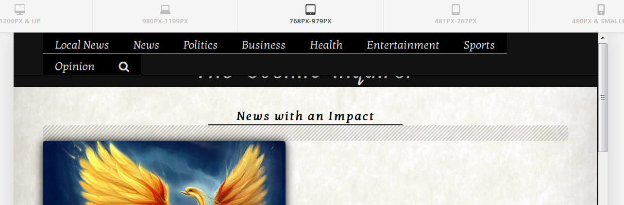
- My menu @768-979 px spilling over into the next line, covering my logo text. I would like this to stay in proper alignment, but can’t seem to align correctly. I tried a few different ways, the most current below.
@media (min-width: 768px) and (max-width: 979px){
.x-nav-wrap.desktop {
display: block !important;
}
.x-btn-navbar.collapsed {
display:none !important;
}
a.x-brand.text {
text-align: left !important;
float: left;
}
}
Thanks for any help.